
Everyone ships a dark mode now. Toggle a button, the background goes black, text goes white. Done.
But that's not dark mode. That's inverted light mode. Good dark mode is a whole different system — and most implementations miss the details that make it actually work.
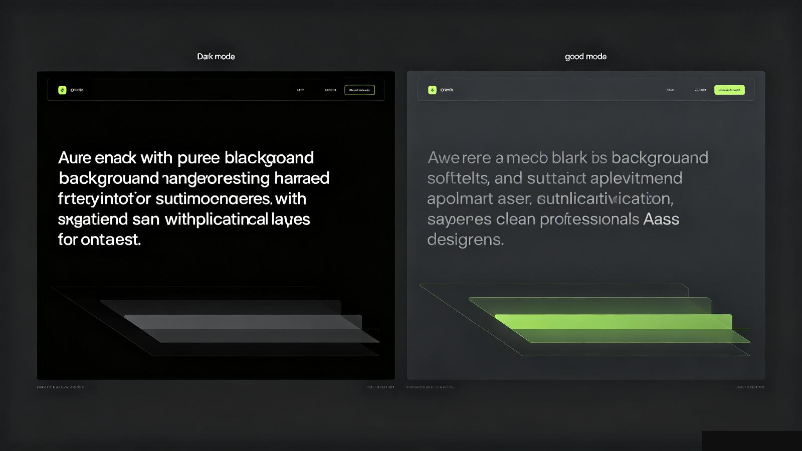
Pure black (#000) might look dramatic on a marketing site, but it's terrible for actual use. Pure black creates harsh contrast with white text — your eyes get tired faster, and it looks cheap.
The best dark modes use dark gray. #111 or #1a1a1a as the base. It's dark enough to feel like dark mode, but soft enough that your eyes don't scream.
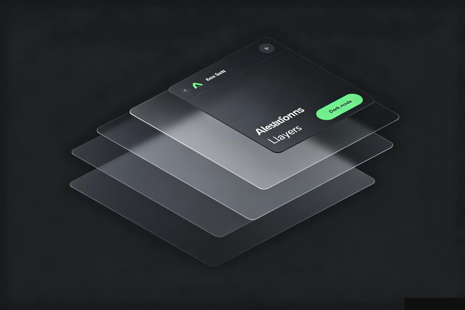
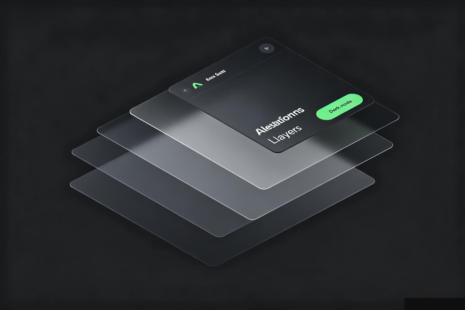
In light mode, you show depth with shadows. A card on a white background casts a subtle shadow downward.
In dark mode, shadows disappear. Everything on black looks flat. So instead of shadows, you use lighter surfaces. Cards are slightly lighter than the background — #1e1e1e on a #121212 base. The lighter surface tells you "this is on top" without needing a shadow.
If you just invert colors and keep the same shadows, your UI looks muddy. The shadows don't show up, and nothing has hierarchy.
In light mode, black text on white is 14:1 contrast. Perfectly readable.
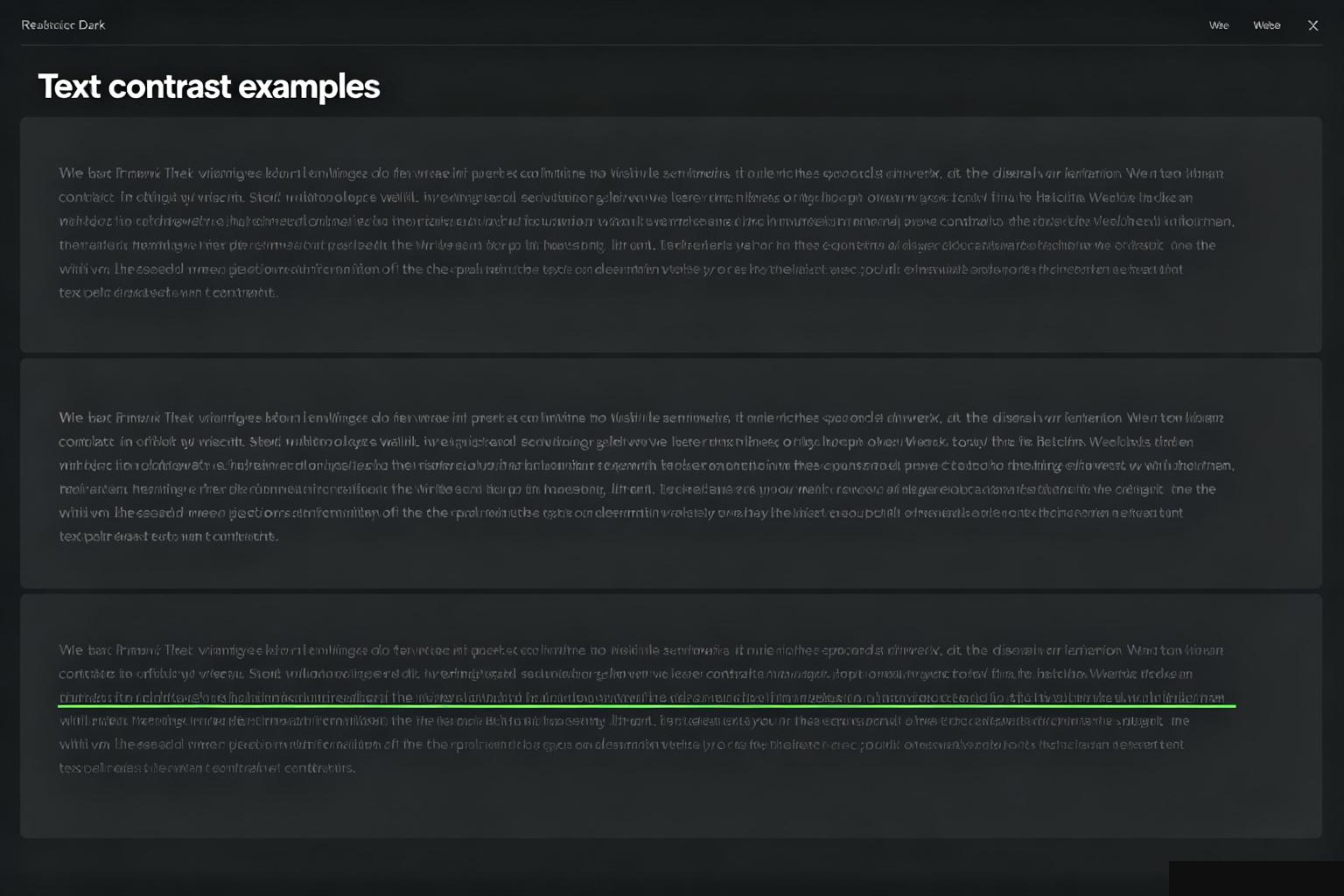
In dark mode, pure white on black is also high contrast — but it's too high. It causes halation, that weird glowing effect when bright text sits on pure black. Your eyes overcompensate.
So you don't use pure white text. You use off-white — #e0e0e0 or #d1d1d1. Lower contrast, but easier on the eyes. Secondary text goes even darker — #a0a0a0.
Your brand green that looked great on white? On dark background it might be too bright, or too saturated. Accent colors need to be slightly desaturated and lighter in dark mode. A button that pops on white might look blinding on black.
This is the part most people skip. They flip the toggle, see it "works," and ship it. But the colors feel off because they were designed for a light environment.
The real cost of dark mode isn't flipping a variable. It's rethinking every color, every shadow, every elevation level for a dark environment. It's why good dark modes feel intentional and bad ones feel like a filter.
Next time you use an app's dark mode and it feels off — too harsh, too flat, colors weird — that's why. It's not dark mode. It's just inverted light mode.




