B2B technology companies face a unique design challenge: they rarely have just one user. A SaaS platform usually has to satisfy two completely different audiences at the same time—the non-technical business decision-maker who signs the check, and the technical developer or IT admin who actually uses the product every day.
If your website leans too far toward marketing fluff, the technical users won't trust you. If it’s too dense with jargon, the business buyers won't understand the value.
When we partnered with ExaVault—a leading secure file transfer platform (now part of Files.com)—to completely rebrand and redesign their website, this was the core problem we had to solve. Here is the methodology we used to build a digital experience that established trust across the board.
1. The Dual Illustration System.
Traditional B2B websites often rely on generic stock photos of people shaking hands, which signals nothing. We needed a visual language that felt technical yet approachable.
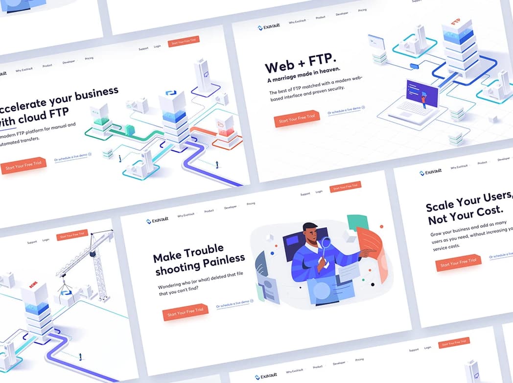
We created a dual illustration system:
- The “File Transfer City” (Isometric): We used clean, structured isometric illustrations to represent the product’s backend architecture and security. This appealed directly to IT professionals, signaling that the system is robust, organized, and technically sound.
- Human-Centric Scenarios: To balance the technical weight, we paired this with warm, relatable illustrations of users collaborating. This helped business decision-makers visualize the human benefit—speed, ease of use, and team collaboration—without getting bogged down in the technical details.
2. Speaking the Developer’s Language.
ExaVault’s core users are developers who integrate with their API. To show ultimate respect for this audience, we designed a dedicated Developer Page featuring a Dark Theme.
This wasn't just an aesthetic choice; it was a UX signal. Developers are famous for preferring dark mode IDEs (Integrated Development Environments). By offering a seamless, code-friendly dark interface specifically for them, we instantly communicated: “We understand your workflow, and we respect your preferences.” It's a subtle detail that builds massive technical credibility.
3. Translating Brand Strategy into Digital Experience.
A website redesign should never happen in a vacuum; it needs to be the digital anchor of a larger brand identity. We stripped away outdated visual clutter and built a system based on clarity, modern typography, and a color palette that balanced enterprise security with modern tech agility. The new website didn't just look like a tech company; it looked like the right tech company to partner with.
The Takeaway:
B2B website design is not about being flashy. It’s about being exact. It is about providing the right visual proof at the right stage of the funnel. When you respect both the buyer’s need for clarity and the developer's need for technical precision, you create an experience that actively drives sales.
CTA: Navigating the needs of both technical developers and business buyers is tough. If you want to see exactly how we built this dual-system for ExaVault, explore the full case study here. Or, if you're facing a similar challenge, let's start a conversation.