
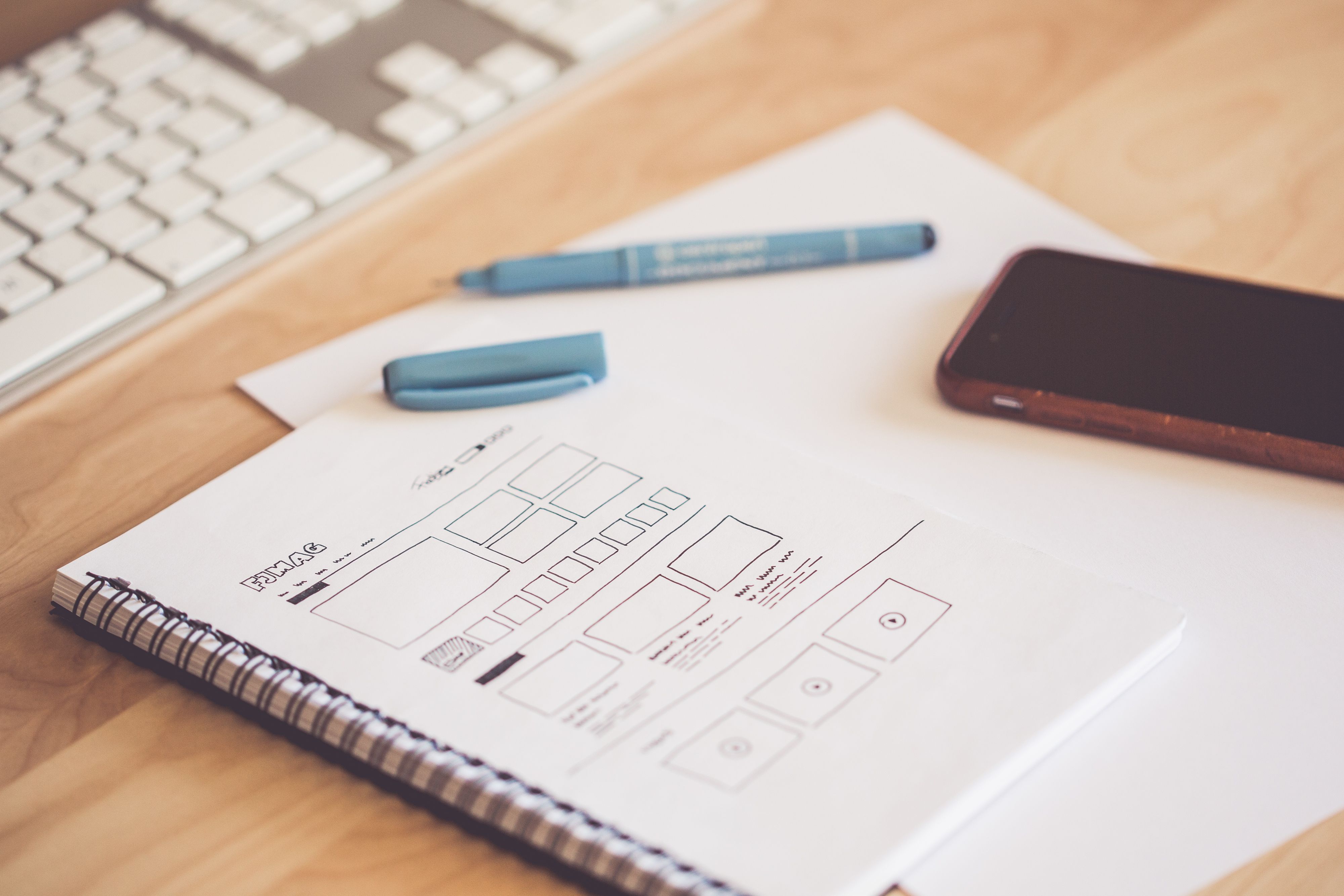
Wireframes are often misunderstood as “just boxes.” But in 2026, product teams are dealing with more complex interfaces, multi-device experiences, AI-generated content, accessibility requirements, and shorter delivery cycles. Wireframes remain one of the cheapest and most effective ways to manage risk.
They do not answer “Does it look good?” They answer: Is the structure right? Is the flow smooth? Is the content complete? Are the priorities clear?
Software engineering has a classic rule: a problem that costs 1 hour to fix during design may cost 10 hours during development and 100 hours after launch.
That is where wireframes prove their value. They let you find structural problems before code is written, before visual design begins, and before the team gets stuck arguing about colors.
Should this page use cards or a list? Should the CTA be above the fold or at the bottom? How many steps does the core task take? These questions are cheapest to fix at the wireframe stage.
TypeProblem It SolvesFocusWireframeStructure and flowInformation hierarchy, layout, navigation, content priorityPrototypeInteraction and statesClicks, transitions, loading, errors, feedbackVisual designBrand and experienceColor, typography, imagery, motion, emotion
The typical order is: wireframe → prototype → visual design.
Skipping wireframes and going straight to visual design often hides structural problems inside a beautiful interface.
Before opening Figma, write down the answers:
If you cannot answer these five questions, wireframing becomes guesswork.
List the features and user journey before opening your tool.
Pro Tip: Describe each page’s goal in one sentence, such as “Help new users complete sign-up in 30 seconds.”
Use only black, white, and gray during wireframing. Color invites premature debates about branding and aesthetics, and those do not belong at this stage.
Create a shared placeholder language:
This helps the team read wireframes quickly without getting stuck on details.
Do not use Lorem Ipsum. Use real headlines, real button labels, and realistic data lengths.
Content should determine layout, not the other way around.
Start at 375px wide, then expand to tablet and desktop.
Mobile forces you to answer: What matters most? What can be removed? What can be moved later?
Only drawing the “happy path” is one of the most common beginner mistakes.
At minimum, consider: empty state, loading, error, success, insufficient permissions, too much content, and too little content.
First wear the “creator hat” and diverge quickly. Then wear the “reviewer hat” and get feedback from 2–3 relevant stakeholders.
Do not create and review at the same time. It kills momentum.
Use clear names: homepage-wireframe-v0.1-2026-10-06.
Avoid final_final_v3_really_final. Version chaos consumes a surprising amount of collaboration time.
Find 5 target users, give them a task, and watch whether they can complete it.
You do not need expensive research. You just need to observe where they hesitate, click wrong, or give up.
Tools like v0.dev, Uizard, and Figma AI can generate layout drafts quickly.
But AI does not know your business strategy, user research insights, or priorities. It is useful for speed, not for replacing thinking.
Accessibility is no longer just a development concern.
Focus order, touch target size, contrast, and semantic structure should all be considered at the wireframe stage. In 2026, WCAG 2.2 AA is a baseline requirement for many projects.
Mapping wireframes to a component library and design system early can dramatically reduce rework.
Buttons, cards, navigation, and form fields should ideally reuse the same structures from the beginning.
Remote teams increasingly rely on FigJam, Miro, Loom, and comment threads.
Wireframes are not just deliverables. They are discussion tools. Good wireframes make meetings shorter and decisions faster.
A wireframe is not a work of art. It is a thinking tool.
The faster you draw, the earlier you find mistakes, and the more money you save.
In 2026, the best wireframe is not the prettiest one. It is the one that helps the team align faster, decide earlier, and rework less.




