
The homepage gets all the design love. The hero animation, the beautiful typography, the perfect product shots.
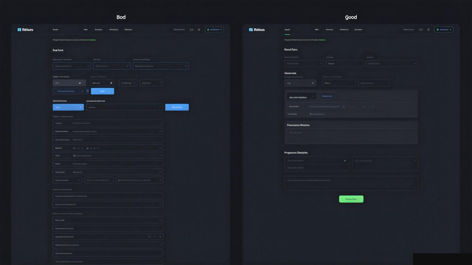
Then the user hits a form. Ten fields on one screen. Generic labels. No explanation why you need their phone number. Submit button at the bottom they have to scroll to find.
And they leave.
Forms are where your design either converts users or loses them. Most teams treat forms as an afterthought. They shouldn't.
A long form is intimidating. Ten fields in one screen feels like homework.
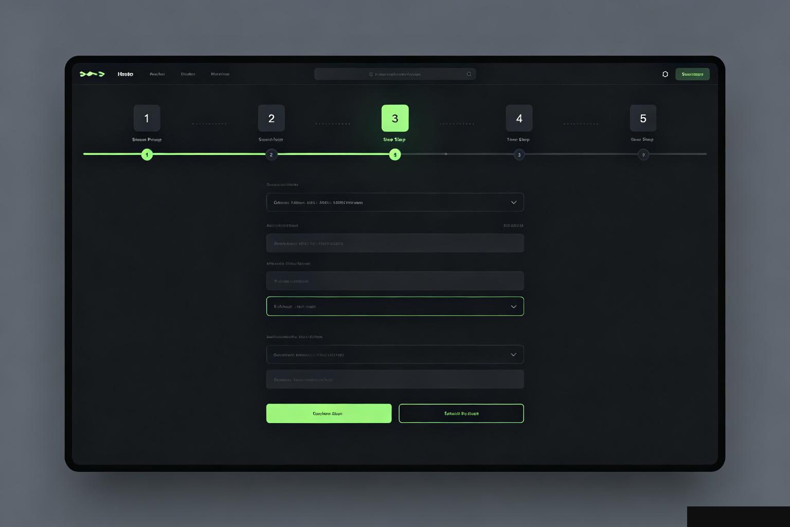
Split it into steps. Three fields per screen max. Show progress — "Step 2 of 4." Users feel like they're making progress, not facing a wall.
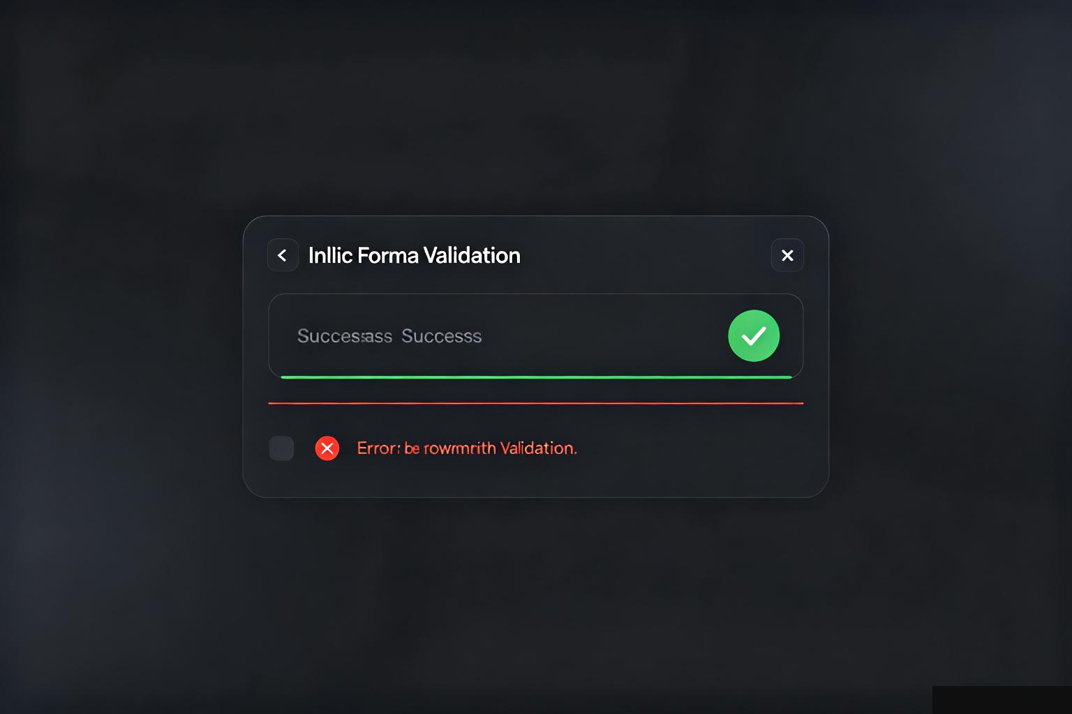
Don't wait until they hit submit to tell them the email is wrong. Validate the field when they leave it. Green checkmark when it's right. Clear message when it's wrong.
Don't just say "Invalid input." Say "That email doesn't look right — check for typos." Tell them what to do, don't just tell them what's wrong.
Every extra field is a reason to abandon. Do you really need their phone number? Their company name? Their job title?
If you can't explain why you need it, don't ask for it. You can always ask later. Asking for everything upfront kills conversion.
Not inside the placeholder. Not floating above. Just right above the input field, left-aligned.
Placeholders disappear when typing, so users forget what the field was for. Floating labels can overlap. Simple labels on top work every time.
It should be the most visually prominent thing on the form. Don't make it the same gray as every other button. Use your accent color. Make it large enough to find without looking.
And tell them what happens after they click. "Create account" is better than "Submit." They want to know they're one click away from done.




