Last month I laid out a 12-column grid for a dashboard in Figma and then did something that violates grid etiquette: I didn’t place anything according to the columns.
Four data cards were set to span 3, span 6, span 4, and span 5. I deliberately let them cross, overlap, and breathe unevenly. Three weeks after launch, the dashboard’s core task completion time dropped from 4.2 minutes to 3.1 minutes. Support questions like “which module does this number belong to?” nearly disappeared. Users’ eyes no longer jumped between equal-width cards; they slid along the differences in size.
Three years ago I wouldn’t have done this. The point of a grid is alignment. A misaligned grid is no grid at all. But that premise is loosening. In 2026, grid design is no longer just a coordinate system for putting content into cells. It is becoming the underlying structure that decides, at runtime, how content is organized, seen, and interacted with.
Apple, Samsung, and Nothing have spent the past year repeating the same layout: rectangular containers of different sizes, creating visual hierarchy inside a strict grid. Bento Grid, inspired by the Japanese bento box, has been listed as an “established” design language in multiple 2026 trend reports.
The real change is happening inside the cells.
In 2023 and 2024, Bento Grid was mostly static. Each cell held one feature, one piece of copy, one image, and that was it. Now each cell is treated more like a micro-application. A weather card actually has rain falling inside it. A data card expands into a second layer of information on hover. A video card is a seamless looping background.
That creates a technical chain reaction. A traditional 12-column grid handles one dimension of a two-dimensional problem: split the page into 12 columns horizontally, then let content flow vertically. Bento Grid requires control over both rows and columns at the same time. One card might occupy 2 columns and 2 rows. The card next to it might occupy 1 column and 3 rows. The alignment between them cannot break in either dimension.
Awwwards-winning grid layouts keep validating the same rule: use grid-auto-flow: dense so the browser fills gaps automatically, and use mathematically verified col-span and row-span values so the cells lock together perfectly. It sounds like an engineering detail, but the visual result is completely different. Without that handling, Bento Grid leaves “ugly holes” in the corners, and the precision of the whole layout collapses.
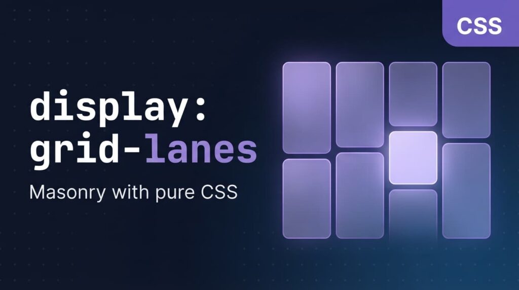
In December 2025, WebKit introduced CSS Grid Lanes in Safari Technology Preview 234, a new display mode for native masonry layout. By March 2026, Safari 26.4 became the first stable browser to support it by default. Firefox added support starting with version 128. Chrome and Edge opened early testing in version 140.
The long-term impact on grid design is bigger than it looks.
For the past decade, masonry layout has been possible almost only through JavaScript libraries. The cost was that layout calculations ran on the client, the first screen visibly jumped, and keyboard navigation and screen-reader order often broke. Grid Lanes moves that capability back into the browser’s native layer. Three lines of CSS can replace a 16KB JavaScript plugin:
css
.gallery { display: grid-lanes; grid-template-columns: repeat(auto-fill, minmax(250px, 1fr)); gap: 16px;}
The browser automatically places each item in the shortest column. No media queries. No container queries. The layout is responsive by default.
But the concept designers should pay attention to is something new Grid Lanes brings: flow-tolerance, called item-tolerance in earlier specifications. It controls how far the browser is allowed to deviate from DOM order for the sake of visual compactness.
Turn the value up, and the visual arrangement becomes tighter, but keyboard navigation may suffer. Turn it down, and there are more gaps, but the Tab order feels more intuitive.
This is a dimension that didn’t exist in the grid design toolbox before. For the first time, designers have to make an explicit trade-off between accessibility and visual density.
One easy-to-miss fact: the most popular Bento Grids of 2026 still sit on top of a 12-column layout and an 8pt spacing system. Apple’s Bento modules, Samsung’s marketing pages, Nothing’s community pages — they look new, but their skeleton is a direct descendant of the Swiss Grid.
12 columns survived because of arithmetic. Twelve can be divided by 2, 3, 4, and 6. Two-column, three-column, four-column, and six-column layouts all get integer column widths. Switch to 10 columns, and a three-column card becomes 3.33 columns. The front end can only approximate with percentages, and those values round differently across browsers. The right edge of a card ends up off by a pixel or two.
The 8pt spacing system works the same way. Every margin, size, and padding value is a multiple of 8, so scaling at @1x, @2x, and @3x never produces half pixels.
The key change is that these two systems now govern separate layers. The 12-column grid manages “where content blocks sit on the page” — how many columns this block takes, which column that block starts from. The 8pt system manages “the breathing rhythm inside a content block” — 32px card padding, 16px between heading and body, 96px between modules. The middle layer, the arrangement of elements inside a component, is left to Flexbox, container queries, or Grid Lanes’ own flow algorithm.
That division has a very practical consequence: designers no longer need to rebuild grid rules from scratch for every new component. The 12-column framework and the 8pt ruler are already there. You only need to decide how wide the component is inside the 12 columns, then lay out its interior using multiples of 8.