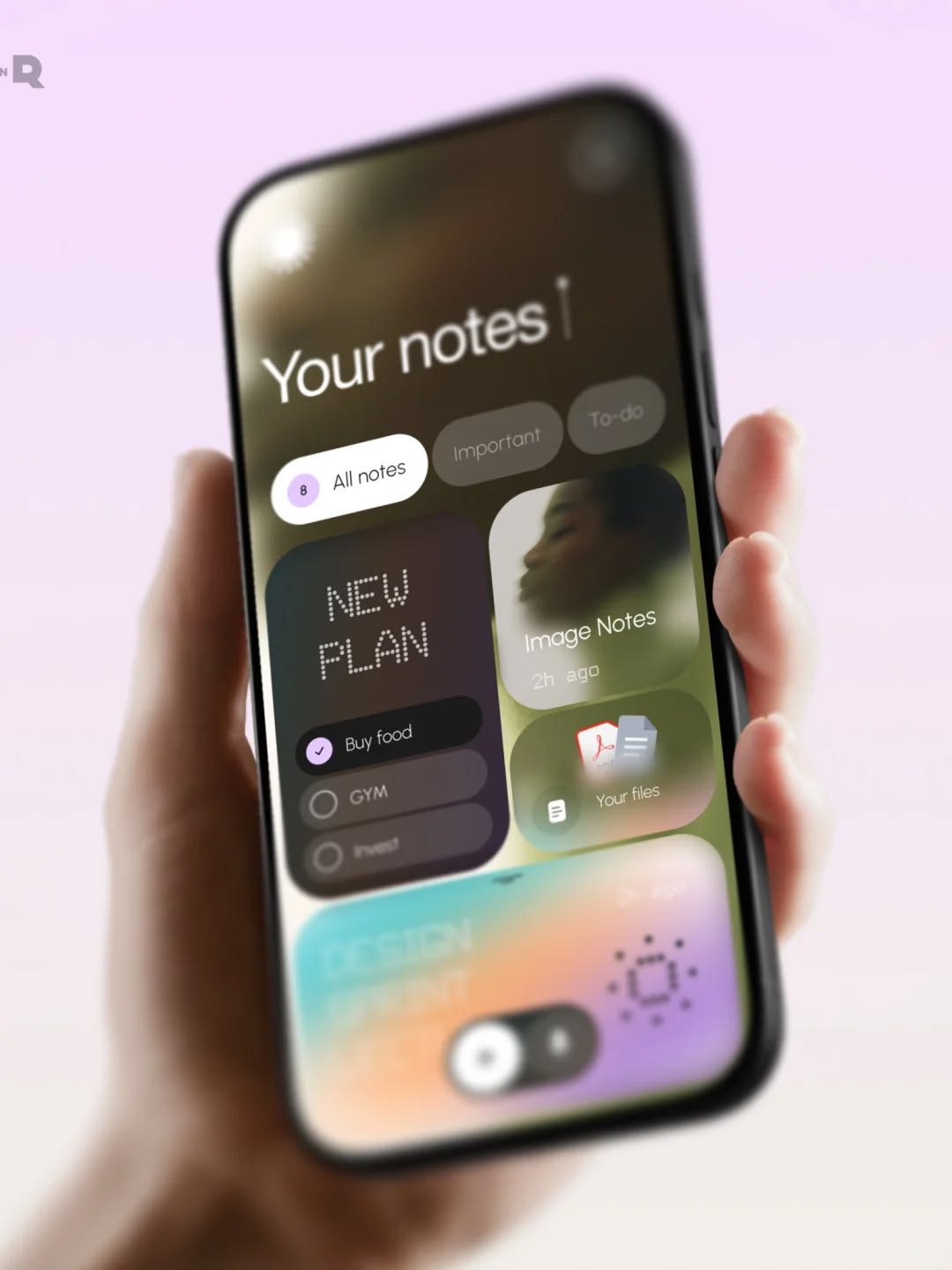
Mobile App Design: Crafting Experiences for the Small Screen
Designing for mobile is different from designing for the desktop. The constraints are tighter — smaller screens, touch input, limited attention, interrupted usage. The opportunities are different too — the device is personal, always with the user, full of context. Great mobile design understands both the constraints and the opportunities. It creates experiences that feel effortless on a screen that fits in the palm of the hand.
This article explores the principles and patterns of great mobile app design: how to design for the small screen, how to make navigation intuitive, how to craft interactions that feel natural, and how to create apps that users not only use but enjoy.
The Unique Nature of Mobile
Before diving into patterns, it is worth understanding what makes mobile fundamentally different. The differences are not just about screen size; they are about the entire context of use.
The screen is small. A phone screen displays a fraction of the information a desktop monitor can. This constraint forces prioritization. Every element on a mobile screen competes for scarce attention and space. Mobile design is the discipline of deciding what matters most and letting the rest go.
The input is touch. Mobile users interact through their fingers, not a precise mouse cursor. This changes everything about target sizes, spacing, gestures, and error tolerance. A button that is easy to click with a mouse can be impossible to tap with a thumb.
The attention is divided. Mobile use is typically fragmented — moments stolen between other activities: waiting for a bus, standing in a line, sitting in a meeting. Sessions are short, interruptions are constant, and users expect to resume where they left off. Mobile apps must respect this fragmented attention and make re-entry effortless.
The context is rich. The phone knows where the user is, what time it is, what they were doing, who they are with. Great mobile apps use this context to be genuinely helpful — a travel app that knows your flight time, a delivery app that knows your address, a weather app that knows your location. Context is mobile's great advantage, and great design uses it.
The device is personal. A phone is not a shared tool like a desktop; it is intimate. It contains personal data, personal preferences, and personal history. Mobile design must respect this intimacy — be trustworthy with data, respectful of notifications, and personal in tone.
Designing for the Thumb
The most fundamental constraint of mobile design is the thumb. Users hold their phones in one hand and reach across the screen with a thumb. The thumb's comfortable reach defines the zones where interaction should happen.
The screen divides into three rough zones. The bottom of the screen is the thumb's natural home — easy to reach, comfortable to tap. The middle is the edge of comfortable reach — usable but requiring some stretch. The top of the screen is the hardest to reach — requiring a thumb stretch or a second hand.
Good mobile design puts the most important interactions where the thumb naturally rests. Primary actions — the things users do most often — belong at the bottom of the screen. This is why so many apps place their primary navigation at the bottom, and why the "add" or "compose" button so often floats at the bottom corner. Placing primary actions at the top of the screen — where desktop design habit puts them — forces users into uncomfortable reaches.
The thumb zone principle also affects target sizes. Interactive elements must be large enough to tap accurately — the recommended minimum is about 44 by 44 points. Small targets cause mis-taps, frustration, and errors. Generous targets with adequate spacing between them make the app feel effortless.
Navigation for the Small Screen
Navigation is where mobile design diverges most sharply from desktop. A desktop site can show a comprehensive menu; a mobile screen cannot. Mobile navigation must be simpler, more focused, and more predictable.
Bottom tab bars are the workhorse of mobile navigation. A row of icons at the bottom of the screen — typically three to five tabs — provides the primary navigation. Bottom tabs are visible, thumb-friendly, and consistent. They work best when the app has a small number of equally important top-level destinations. The active tab is always highlighted, and switching between tabs is a single thumb tap.
The hamburger menu — a button that opens a hidden navigation drawer — was once the default for mobile navigation. It has fallen out of favor for good reasons: it hides navigation behind a tap, puts it in the hardest-to-reach corner, and hides the structure of the app. Modern mobile design prefers visible, thumb-accessible navigation over hidden menus. When a drawer is necessary — for secondary navigation, settings, or large information structures — it should be well-organized and clearly labeled.
Search is essential for content-rich apps. Users who know what they want should not have to browse a navigation tree; they should be able to search. A prominent search bar, or a clear search icon, makes search part of the app's core workflow.
Cards and lists are the primary content containers of mobile design. Content is presented as a scrollable stream — cards for visual, varied content, lists for text and structured content. This pattern is native to mobile: users scroll naturally, and the content flows vertically through the thumb zone.
The Mobile Layout
Mobile layouts must make the most of limited space while keeping content clear and scannable.
One primary action per screen. A mobile screen should lead the user toward a single primary action. Too many competing actions create confusion and dilute attention. The primary action — "Add," "Buy," "Send," "Save" — should be visually prominent and placed where the thumb can reach it. Secondary actions should be de-emphasized or hidden behind menus.
Clear visual hierarchy. On a small screen, hierarchy matters more than ever. The most important information must be immediately visible and scannable. Use size, weight, and color to establish hierarchy — but remember that users cannot absorb much at once. Mobile screens should be simple: one idea, clearly expressed.
Generous spacing. Mobile design needs room to breathe. Dense layouts that try to pack information into the small screen become cluttered and unreadable. Generous spacing, clear grouping, and visual separation make content scannable and interactions precise. The principle is simple: give each element enough room to be clearly seen and easily tapped.
Design for the edge. The edges of the screen present special challenges. Interactive elements at the very edge are hard to reach with the thumb and easy to mis-tap. System gestures — swiping from the edge to go back, pulling down for notifications — occupy the edges. Designers must be aware of these system interactions and design around them.
Interactions and Feedback
Mobile apps live or die by their interactions. A desktop user can hover for feedback; a mobile user cannot. Touch gives no hover state, so mobile feedback must come through other means.
Instant visual feedback. Every touch should produce an immediate visual response. A button should visibly depress, a card should highlight, a list item should respond. This feedback confirms the touch was registered and builds confidence. Apps that feel "dead" — where touches produce no response — feel broken.
Clear affordances. Users must be able to tell what is tappable and what is not. Buttons should look like buttons, links like links, cards like cards. When visual affordances are unclear, users tap hesitantly or not at all. The design must communicate interactivity clearly.
Meaningful micro-interactions. The small animations and transitions that respond to user actions — a button transforming into a spinner, a card expanding into a detail view, a switch sliding into place — are micro-interactions. Done well, they provide feedback, communicate state, and add delight. They make the app feel responsive and crafted. Done poorly — or absent — the app feels flat and unpolished.
Appropriate loading states. Mobile connections are variable; loading is inevitable. How the app handles loading defines much of its perceived quality. Skeleton screens — gray placeholders in the shape of the incoming content — feel faster than spinners and set expectations. Progress indicators communicate that work is happening. Empty states and error states — designed, not default — turn frustration into guidance.
Gestures, used carefully. Mobile supports gestures — swipe, pinch, long-press — that have no desktop equivalent. Gestures can make an app feel powerful and natural. But they are also invisible: users cannot see what is not on screen, and discoverability is a constant challenge. Gestures should supplement visible controls, not replace them. The most reliable design assumption is that users will not discover a gesture unless it is taught, shown, or discoverable through convention.
Onboarding and the First Experience
The first minutes with an app determine whether users stay. Onboarding is the design of those first minutes — and it is one of the highest-leverage areas of mobile design.
Respect the user's time. Users install an app because they want something — a result, an experience, a solution. The worst onboarding is a wall of screens that delays the user from getting it. Every onboarding screen should justify its existence. If a screen can be removed, remove it. The fastest way to a user's heart is respecting their time.
Onboard by doing. The best onboarding is not explanation; it is action. Let users accomplish something meaningful in their first minutes with the app. Guide them through the first task, show them the value, and let the app teach itself through use. A user who has completed a real task with an app understands it better than a user who has watched a tutorial.
Ask for permissions in context. Apps need permissions — notifications, location, camera, contacts. Asking for all permissions up front, in a wall of prompts, is hostile to users and legally risky. Asking for each permission in context — when the feature that needs it is being used — is respectful and more successful. The user who has just tried to share their location understands why the app needs location access; the user who has been prompted before doing anything does not.
Provide a clear path to value. Every onboarding flow should lead to the moment where the user experiences the app's core value. That moment — the "aha" — is what converts a download into a loyal user. Design the onboarding to reach it as quickly and clearly as possible.
The Mobile App Design Process
Great mobile design does not emerge from a single burst of inspiration; it emerges from a disciplined process. The process for mobile apps shares the fundamentals of all design processes — research, wireframing, prototyping, testing, iteration — but with mobile-specific emphases.
Start with the user and context. Mobile design begins with understanding the users and their context: when and where they use the app, what they are trying to accomplish, what frustrates them. The research methods covered throughout this series — interviews, usability testing, observation — apply with particular force to mobile, where context and constraint shape everything.
Design for the flow, not just the screens. The most important mobile design decisions are about flows — the sequences of actions that accomplish tasks. Sketch the key flows early: onboarding, first task, returning visit, common tasks, edge cases. A flow that works on paper is the foundation of an app that works in practice.
Prototype and test on device. Mobile prototypes should be tested on real devices, not just in design tools. The feel of an interaction — the weight of a gesture, the timing of a transition, the reach of a thumb — cannot be fully experienced in a desktop browser. Testing on device reveals what the design file cannot.
Iterate with real users. The mobile design process is a loop: design, test, learn, revise. Small rounds of testing with real users — five participants, focused tasks — reveal the usability problems that internal review misses. Each iteration brings the app closer to the effortless experience users expect.
Common Mistakes in Mobile Design
Recognizing the common failures of mobile design helps avoid them.
Mistake one: treating mobile as a smaller desktop. Simply shrinking a desktop design to a phone screen produces a cluttered, unreadable, unreachable mess. Mobile requires its own design, built for its own constraints and opportunities.
Mistake two: placing primary actions out of thumb reach. Primary actions at the top of the screen force uncomfortable reaches and mis-taps. The most important interactions belong at the bottom, where the thumb lives.
Mistake three: small, crowded tap targets. Tiny buttons packed tightly together cause mis-taps and frustration. Generous targets with adequate spacing are non-negotiable.
Mistake four: hiding everything behind menus. Navigation hidden behind hamburger menus makes the app's structure invisible and forces extra taps. Visible, thumb-accessible navigation is better for most apps.
Mistake five: neglecting loading and empty states. Apps that show blank screens or generic spinners during loading, and default emptiness when content is absent, feel unfinished. Designed loading, empty, and error states turn these moments into guidance.
Mistake six: ignoring the platform. iOS and Android have different conventions, different navigation patterns, and different expectations. An app designed for one platform and copied to the other feels foreign on both. Design for the platform's conventions while maintaining the brand's identity.
Conclusion
Mobile is not a smaller desktop; it is a different medium with its own rules. The small screen demands prioritization. The thumb demands reachable interaction. The touch interface demands instant feedback. The fragmented attention demands effortless re-entry. The rich context demands genuine usefulness. The personal device demands trust.
The apps that feel great — the ones users reach for without thinking, the ones that make tasks feel easy — are the ones whose designers understood these rules. They prioritized ruthlessly, placing the essential within thumb reach and letting the rest go. They built navigation that is visible and predictable. They crafted interactions with feedback and micro-interactions that make the app feel alive. They respected the user's time, onboarding by doing rather than explaining. They designed for the flow, tested on device, and iterated with real users.
Mobile design is a discipline of constraint — of doing more with less, of clarity within limits, of crafting an experience that fits in the hand. It is also a discipline of opportunity — of using the phone's context and intimacy to create experiences that no other medium can match. The designers who master it create apps that are not just used but loved — apps that fit so naturally into people's lives that they become invisible, and the user's task becomes everything. That is the goal of mobile design: not to make an app the user thinks about, but to make the user's life work so smoothly that the app disappears into the moment.