
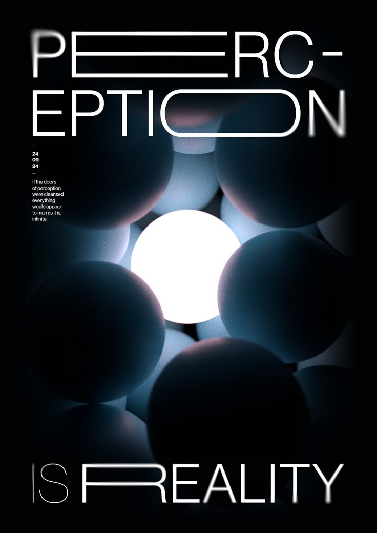
Spatial Depth Is Not Whitespace—It’s the Physical Ordering of Attention
Last year I worked on a redesign for a home goods e-commerce detail page. The product photos were excellent, but the page felt flat—everything sat on the same plane, and users didn’t know where to look as they scrolled. The designer’s first move was to add more whitespace, pushing spacing from 24px to 48px. The page did feel more “airy,” but the problem didn’t go away. Users still couldn’t find the focal point, and add-to-cart rate didn’t move.
Then we changed our approach. Instead of treating spatial depth as “empty space,” we treated it as “front-to-back relationships.” We scaled the main image to fill the container width and gave it a very subtle multi-layered shadow. The background lifestyle shot was desaturated and slightly blurred. The price and specs card floated above the image with a `backdrop-filter`. Two weeks after launch, add-to-cart rate on the detail page went from 3.1% to 4.4%.
Spatial depth is not whitespace. Spatial depth is the set of visual cues that tell users: what’s in front, what’s behind, and what matters more. Its real job is the physical ordering of attention.
## Whitespace Is Only the Shallowest Layer
Many people equate spatial depth with “lots of whitespace.” Whitespace helps, but it only solves the problem of “not feeling cramped.” It doesn’t solve the problem of “having hierarchy.”
What actually creates spatial depth is **scale contrast** and **spacing rhythm**. A 48px heading and 16px body text aren’t separated by a uniform 24px gap—they’re separated by 40px. Modules aren’t all spaced 80px apart—some are 120px, some are 64px. That uneven rhythm makes the eye feel “this block stands alone” or “that block belongs with the one above it.”
A simple test: convert a screenshot of your page to grayscale. If you can still tell which elements are in front, which are behind, which are grouped, and which are separate, spatial depth is working. If everything blurs into one flat mess, adding more whitespace won’t help. I’ve seen a SaaS homepage where the grayscale version had crystal-clear hierarchy—turned out it barely used any shadows. The depth came entirely from scale and spacing. I’ve also seen a portfolio page that looked beautiful in color but completely collapsed in grayscale, because every bit of depth relied on shadows.
## The Third Shadow Layer Is the One That Matters
Shadows are the most direct tool for building front-to-back relationships. Multi-layered shadows are now standard practice, but many people stop after two layers.
```css
box-shadow:
0 1px 2px rgba(0,0,0,0.04),
0 4px 8px rgba(0,0,0,0.05),
0 16px 32px rgba(0,0,0,0.08);
```
The first layer defines the edge. The second layer creates a slight lift. The third layer is what actually makes the card “float”—a large blur radius, very low opacity, ambient light diffusion. With only the first two layers, the card looks like a paper cutout pasted onto the page. Add the third, and it feels like it’s genuinely hovering above the surface.
You can see this logic on Linear, Vercel, and Stripe. Their shadows are almost invisible on light backgrounds, but remove them and the page immediately goes flat. That tells you the shadow’s job isn’t to be seen—it’s to be felt.
## Blur and Depth of Field: Push the Background Back, Keep the Foreground Sharp
Another depth cue the human eye uses is blur. Near things are sharp; far things are blurred. Page design can borrow this mechanism.
`backdrop-filter: blur(12px)` is the most common depth-of-field tool right now. A navigation bar stays fixed at the top while content scrolls underneath, and the blur layer makes the nav float above the content. When a modal opens, the page behind it blurs, and focus naturally moves to the dialog.
But blur trades performance for spatial depth. `backdrop-filter` is expensive on mobile and high-refresh-rate screens. We tested this on an iPad Pro 120Hz page: a small blurred nav bar held a steady 120fps. But applying the same blur to half the hero area dropped it to around 80fps, with a noticeable stutter during scroll. A practical rule: only use blur on small, fixed-position elements—not on large scrolling areas.
Another technique is to add a low-opacity overlay to a background image instead of blurring the image itself. Foreground text stays more readable, and the spatial hierarchy is clearer.
## Color Also Creates Depth
Warm colors advance; cool colors recede. This is a basic mechanism of the human visual system. A card with a warm background will feel closer than a cool-background card, even without a shadow.
This is especially obvious in dark mode. In dark mode, shadows are nearly invisible, so depth comes mainly from lightness and color temperature. A warm button on a cool background naturally feels like it’s floating on the surface. Conversely, if every element has the same color temperature, the page will feel flat even with shadows.
Lightness contrast works the same way. Light elements advance on a dark background; dark elements advance on a light background. Many dark-mode design systems deliberately make cards one step lighter than the background, rather than relying on shadows to separate layers.
## Motion as a Spatial Cue: Only Works If Used Carefully
Parallax and 3D tilt are the easiest ways to make a page feel “deep,” but they’re also the easiest to get wrong.
We once built parallax scrolling for a portfolio site. It worked beautifully on desktop—background layers moved slower, foreground layers moved faster—and users said it felt “immersive.” But after launch on mobile, problems appeared: layers misaligned during scroll, and several users reported dizziness. We ended up keeping only a 20px parallax range on the first screen and respecting `prefers-reduced-motion`. That solved it.
3D tilt works similarly. `perspective` plus `rotateX` or `rotateY` makes a card tilt slightly on hover, creating a real sense of depth. But keep the tilt angle under 6 degrees, or it becomes disorienting. And when the card tilts, the shadow direction on its edges needs to shift too—otherwise the lighting logic contradicts itself and it looks like a plastic sheet wobbling around.
## Spatial Depth and Accessibility Are Not in Conflict
Some worry that strong spatial depth hurts accessibility. In practice, the two can coexist.
The key is: spatial cues cannot be the only source of information. If “which button is primary” is communicated only through shadow and size, users will get lost in grayscale or high-contrast mode. So the primary button also needs color contrast and clear copy. Spatial depth is an assist, not a replacement.
Also, `prefers-reduced-motion` must be respected. Parallax, 3D tilt, and scroll animations should all degrade to a static layout when the user enables reduced motion. Spatial depth can remain, but motion should be turned off.
## A Check You Can Do Right Now
Open your page, take a screenshot, convert it to grayscale, and ask yourself three questions:
1. Can I tell at a glance which card is in front?
2. Can I tell which two modules are grouped together, and which one stands alone?
3. If I remove all shadows, does the page still have hierarchy?
If the answer to the third question is “no,” your spatial depth is basically held up by shadows alone. Real spatial depth should come from scale, spacing, blur, color, and motion working together. Shadow is just one layer.
The goal of spatial depth design isn’t to make the page “look good.” It’s to make users scroll without thinking about where to look next.
---




