Walk into almost any convenience store and stand in front of the ice cream freezer. Most of what you see is white: white lids, white backgrounds, a product photo, a small logo. The category has trained shoppers to scan, not read. In that environment, color is not decoration. It is the first decision the packaging makes on behalf of the brand.
For Jamie’s ice cream packaging project, the brief was not simply “make it look appealing.” The packaging needed to do two jobs at once: stop a younger shopper at the freezer door, and plant something that a 30-something shopper would recognize later. Those are two different time scales. One is measured in 1.5 seconds. The other is measured in years.
The macaron palette was the tool that connected them.
The shelf problem: color has to answer before words do
In a crowded freezer, nobody reads the flavor name first. They see a color, and the color answers a question before the conscious mind catches up: Is this strawberry? Is this mango? Is this the one I want right now?
That is why packaging color psychology is not a soft subject. On a shelf, color is an information system. It carries category cues, flavor expectations, price associations, and a sense of who the product is for. If the color is wrong, the shopper does not necessarily reject the brand. They simply stop looking. The packaging never gets a second chance.
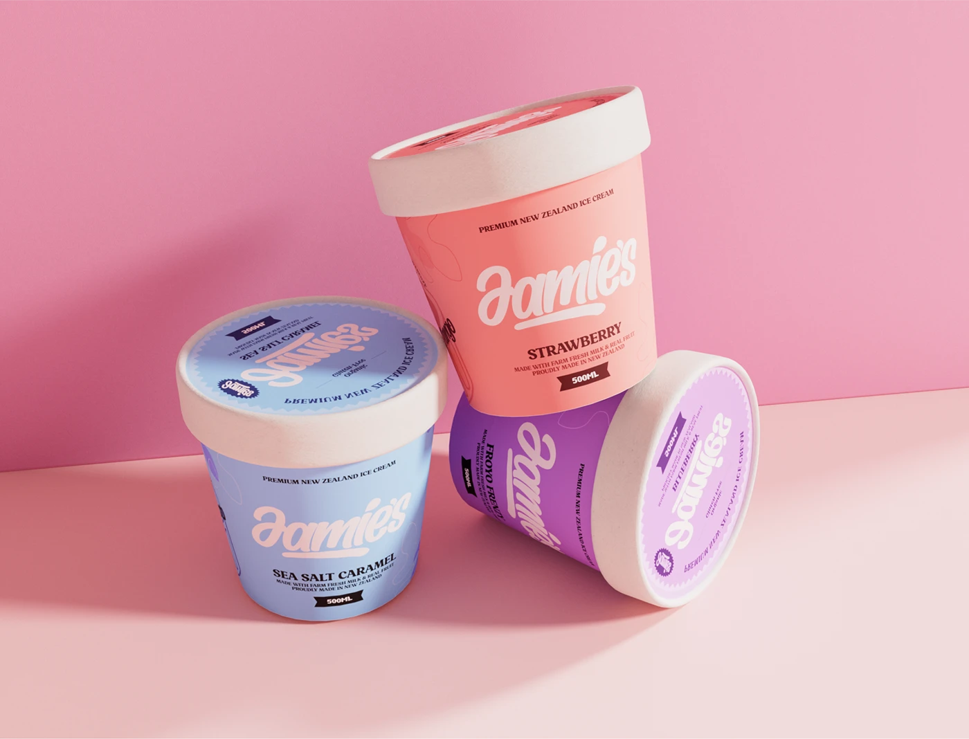
Jamie’s could have used high-saturation candy colors to shout louder. It could have used minimal white to look premium. It chose a macaron range instead: soft strawberry pink, mango yellow, mint green, and deeper tones that move from bright to warm. The result is a palette that is bright enough to break the white shelf, but soft enough not to feel cheap. That middle band is where the design decision lives.
Job one: what the color does in the first 1.5 seconds
The first job is immediate. The macaron tones do three things before the shopper reads a single word.
First, they match flavor expectation before brand personality. A strawberry pink does not need to explain itself. A mango yellow does not need a label. The color pre-sorts the range in the shopper’s mind, so the eyes can move faster than the reading process. This is packaging color psychology in its most practical form: the color is not there to express the designer’s taste. It is there to reduce decision friction.
Second, the saturation is deliberately held in the middle. Macaron colors are not fluorescent, and they are not pastel to the point of disappearing. They sit in a narrow band that feels bright on the shelf but calm in the hand. That matters because the freezer is a high-noise environment. A color that screams may win attention once, but it rarely builds repeat purchase. A color that feels comfortable can stay in someone’s hand long enough to become familiar.
Third, the palette works as a system, not as six separate colors. This is the part that is easy to miss. Six flavors do not mean six unrelated color decisions. They mean one color system with six positions. The range moves across a mood spectrum: lighter, fruit-forward tones at one end, deeper, warmer tones at the other. That structure gives the brand room to add a seventh or eighth SKU later without redesigning the entire shelf presence. A good packaging system is not judged by how it looks with three SKUs. It is judged by whether it still holds together with ten.
The case study puts it simply: Color is the flavor. The cup is the feeling. That line is not a slogan. It describes the division of labor. The color carries the flavor cue. The cup, the illustration, and the information panel carry the emotional and brand layer.
Job two: the memory the color is planting
The second job is slower, and it is the more interesting one.
For a 16-year-old standing in front of the freezer, the macaron palette reads as immediate pleasure. It is low-pressure, friendly, and easy to like. It does not feel like a brand talking down to them. It feels like a small, affordable moment in the middle of a school day.
For a 30-year-old, the same palette can do something different. It can recall the feeling of opening a freezer door on a hot afternoon, the cold air hitting your face, and a bright color catching your eye before you had time to think. Not the product itself, necessarily. The afternoon. The walk home. The small ritual of choosing something for yourself.
That is the difference between a color that sells and a color that stays. The macaron tones are not “retro” in a literal sense. They are not copying a specific decade. They are using a soft, familiar color language to trigger a shared scene that many people carry from childhood and adolescence: the corner shop freezer, the bright packaging, the small decision that felt like a treat.
This is where the project becomes more than a pretty palette. The same color system is speaking to two audiences at once. To a younger shopper, it says: this is for now. To an older shopper, it says: you remember this. Those are not two different colors. They are two time scales layered into one system.
That is also why the palette should not be reduced to “colors that appeal to young women.” That framing is too narrow, and it turns a design decision into a gender stereotype. The more accurate description is this: the palette lowers the pressure of the first glance. It creates an emotional entry point that does not require the shopper to already know the brand. The fact that it reads as friendly, soft, and approachable is a design strategy, not a demographic shortcut.
What has to be true for this to work
A macaron palette is not a universal solution. It worked for Jamie’s because three conditions were met.
The color has to align with flavor expectation. Ice cream has a natural color-to-flavor vocabulary: pink for strawberry, yellow for mango, green for mint. If the category does not have that vocabulary, a macaron palette can create confusion rather than recognition. The color has to feel inevitable, not imposed.
The layout has to be restrained enough to let color lead. In the Jamie’s system, the illustration occupies a controlled portion of the pack, and the information panel is kept strict. The color is the main variable. If the typography, illustration, and layout are all competing for attention, the palette gets buried. Color can only do its job when the rest of the composition knows when to step back.
The memory has to be anchored to a shared scene. Color is a trigger, but a trigger needs a negative to develop. For Jamie’s, that negative is the convenience-store freezer and the after-school afternoon. If a brand has no shared scene to activate, nostalgia becomes a mood board rather than a strategy. The question is not “what color feels nostalgic?” The question is “what scene are we asking people to remember?”
Three questions before you use color to do two jobs
If you are building a packaging system and want color to work on both the shelf and in memory, start here.
- What is the first judgment your color makes in 1.5 seconds? Flavor? Price tier? “This is for someone like me”? If the answer is unclear, the shelf will make the judgment for you.
- What will make this color memorable in five years? Is it memorable because it is attractive, or because it is attached to a specific moment, ritual, or scene?
- If you add three new SKUs tomorrow, does your color system have room for them? A palette that only works for the current range is a set of colors. A palette that can extend is a system.
The Jamie’s project is a useful example because it refuses to separate those questions. The same macaron tones that help a shopper choose in 1.5 seconds are also doing the slower work of building a shared visual memory. That is what a packaging system is for: not just to look good on a shelf, but to keep working after the shelf has been left behind.
If you are building a multi-SKU packaging system, or trying to decide what your color palette should really be doing, you can see how we approach packaging and brand systems here. You can also explore the full Jamie’s ice cream packaging case study.