
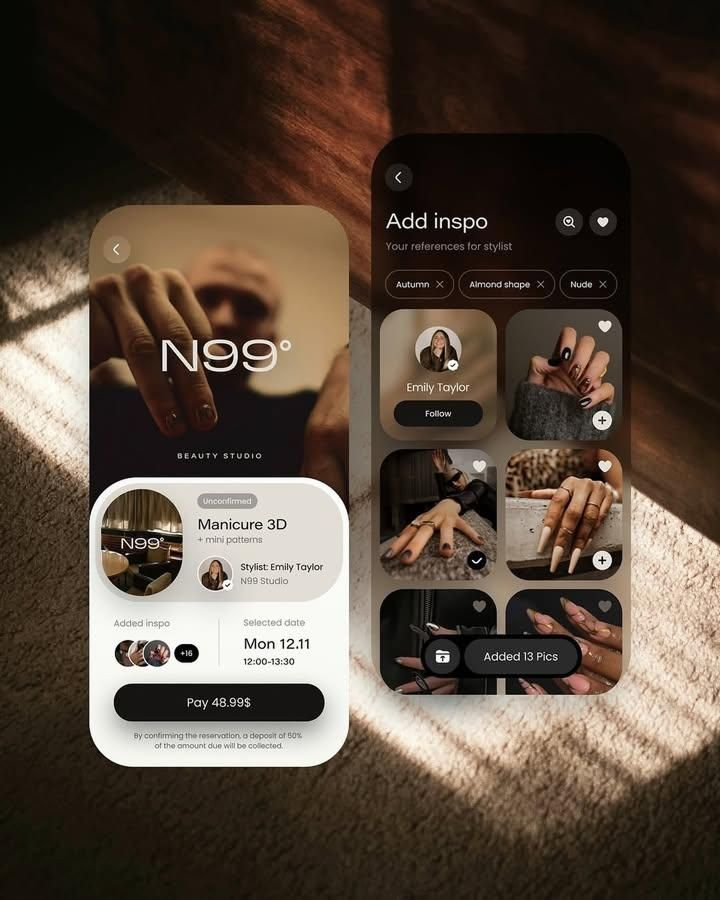
The App Design Process: From Concept to High-Fidelity Prototype
Too many teams skip steps. They jump straight into visual design, crafting beautiful screens based on assumptions rather than evidence. The result is often an app that looks impressive but fails to resonate with users. A disciplined design process guards against this. Below is a practical, step-by-step walkthrough of how great apps are designed.
Step 1: Research and Discovery
Before designing anything, you must understand the landscape. This means understanding your users, your competitors, and the business context.
User research is the foundation. Conduct interviews with potential users, observe their behavior, and identify the frustrations they experience with existing solutions. Look for patterns. What tasks do they struggle with? What workarounds have they invented? What emotional states are they in when they use this type of app? A fitness app used at 6 a.m. by a groggy user requires a very different design than a banking app used by someone anxiously checking their balance.
Competitive analysis comes next. Study the apps already in this space. What do they do well? Where do they fall short? Look for patterns in navigation, onboarding, and core flows. But do not simply copy — the goal is to identify opportunities to differentiate. A thorough competitive analysis reveals gaps in the market that your app can fill.
Finally, align on business goals. What does success look like? Is it user retention, revenue, brand awareness, or something else? Every design decision should ultimately serve these goals. Document them and refer back to them throughout the process.
Step 2: Define the Problem and User Flows
With research in hand, synthesize your findings into a clear problem statement. This should be specific, user-centered, and actionable. For example: "Busy professionals struggle to track their daily water intake because existing apps require manual logging that feels like a chore." A well-defined problem statement keeps the team focused and provides a benchmark against which to measure design solutions.
Next, create user personas — fictional representations of your key user segments, based on real research data. Each persona should include goals, frustrations, device habits, and relevant context. Personas humanize the data and help the team make design decisions that serve real people rather than abstract averages.
Then map out user flows. A user flow is a step-by-step diagram of the path a user takes to complete a key task: signing up, making a purchase, setting a goal, or any other critical action. User flows reveal complexity before you design a single screen. If a flow requires ten steps to accomplish something simple, that is a signal to simplify.
Step 3: Information Architecture and Wireframing
Information architecture (IA) is the structural backbone of your app. It defines how content is organized, how screens relate to each other, and how users navigate through the experience. A clear IA ensures that users can find what they need without thinking about it.
Start by defining the app's core navigation structure. Will it use a tab bar, a hamburger menu, a sidebar, or something custom? The answer depends on the number of top-level sections and how frequently users need to switch between them. As a general rule, the most important features should be one tap away.
Once the IA is established, move to wireframing. Wireframes are low-fidelity, black-and-white layouts that focus on structure and functionality, not visual style. They answer questions like: Where does the button go? How much space does the image take up? What is the hierarchy of information on this screen?
Wireframes should be quick and disposable. Use pen and paper, a whiteboard, or a simple digital tool. The goal is to explore many ideas rapidly without investing time in visual polish. Sketch multiple variations of key screens, then critique them as a team. Which layout best supports the user's task? Which creates the clearest hierarchy?
Step 4: Prototyping and User Testing
A wireframe is static; a prototype is interactive. Prototyping turns your static screens into a clickable experience that simulates how the real app will feel. This is where your design starts to live and breathe.
Even a simple prototype — linking a handful of screens together with basic transitions — is enormously valuable. It allows you to test the flow before investing in high-fidelity visuals. You can identify confusing navigation, missing steps, and interaction patterns that feel awkward.
User testing is the most important part of this stage. Show your prototype to real users — ideally people who match your target personas — and observe them as they try to complete key tasks. Do not explain the interface. Do not guide them. Simply watch where they get stuck, what they tap on by mistake, and what they find intuitive.
User testing often reveals uncomfortable truths. A navigation pattern that seemed obvious to the design team might confuse every user who tests it. That is okay — that is exactly why you test. The goal is to find these problems now, when fixing them costs hours, not after launch, when fixing them costs users.
Iterate based on what you learn. Revise the wireframes, update the prototype, and test again. This cycle — design, test, learn, repeat — is the heart of user-centered design.
Step 5: Visual Design
Only after the structure, flows, and interactions have been validated through testing should you move into visual design. This is where your app gets its look and feel: color, typography, iconography, imagery, spacing, and motion.
Start by defining a design system — a set of reusable components and style guidelines that ensure consistency across the app. This includes:
- Color palette: primary, secondary, background, surface, and semantic colors (success, warning, error). Ensure all color combinations meet accessibility contrast standards.
- Typography: a type scale with defined sizes, weights, and line heights for headings, body text, captions, and labels. Choose fonts that are legible on small screens and reflect the brand's personality.
- Components: buttons, input fields, cards, navigation bars, modals, and other reusable UI elements. Define their various states (default, hover, pressed, disabled, focused).
- Spacing system: a consistent set of spacing values (typically based on a 4px or 8px grid) that governs margins, padding, and gaps between elements.
Visual design should reinforce the app's purpose and brand. A meditation app might use soft colors, generous spacing, and gentle typography to create a calming feeling. A stock trading app might use bold typography, high-contrast colors, and tight spacing to convey urgency and precision. Every visual decision should communicate something.
Step 6: High-Fidelity Prototype and Handoff
With visual design complete, build a high-fidelity prototype that looks and behaves like the real product. This includes detailed interactions, transitions, animations, and microinteractions. A high-fidelity prototype is valuable for final user testing, stakeholder presentations, and developer handoff.
During developer handoff, provide engineers with everything they need to build the design accurately:
- Complete design files with organized layers and named components
- A detailed design system or style guide with exact values for colors, typography, spacing, and component states
- Specifications for animations and interactions, including duration, easing curves, and trigger conditions
- Accessibility guidelines, including contrast ratios, touch target sizes, and screen reader labels
Good handoff is a collaboration, not a one-way transfer. Designers should remain available to answer questions, review implementations, and make adjustments as technical constraints emerge.
Conclusion
The app design process is not a linear checklist. It is a cycle of research, ideation, prototyping, testing, and refinement. Some steps will overlap; some will need to be revisited. The most important habit a design team can cultivate is iteration — the willingness to throw work away and start over when evidence shows that a different approach is better.
What separates great apps from mediocre ones is rarely a single brilliant idea. It is the discipline to follow a process, to test assumptions, to listen to users, and to refine the experience until it feels effortless. A beautiful screen is easy to create. An app that truly solves a problem for its users — that is the product of a thoughtful, rigorous design process.




