
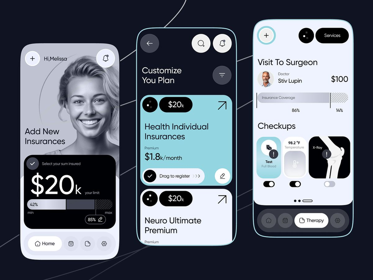
Everyone designs the happy path. The hero screen, the perfect empty state, the polished dashboard with real data. But the moments where the product actually proves itself are the ones nobody pays attention to.
I'm talking about loading states, empty states, error states. The stuff that happens between "you clicked" and "here's your content."
When someone clicks a button, they need to hear from the interface within 100 milliseconds. If nothing happens, they start doubting — did the click register? Should I click again?
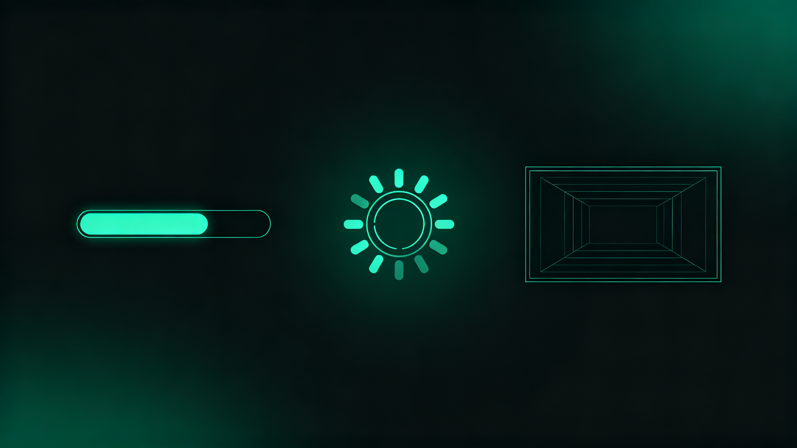
That's why every button needs instant feedback. Not a spinner. Not "loading..." text. Just the button changing color, or shrinking slightly, or a ripple. Something that says "got it, working on it."
If the actual operation takes 200ms or more, then you add the loading indicator. But that first 100ms — the button's immediate response — that's the part that makes the product feel fast. Even when it isn't.

The old way was: click, show a spinner, wait for data, then replace spinner with content. The user stares at a circle going around.
The new way is skeleton screens: show the layout first, with gray blocks where the text and images will go. Then fill them in as data arrives.
Why is this better? Because the user isn't waiting for something to appear. They're already looking at the structure — they just don't have the content yet. It feels faster even when the actual load time is the same.
When someone opens your product for the first time, there's nothing there. No data, no messages, no projects. Most designers just put a sad icon and "No items yet."
That's a wasted opportunity. The empty state is the first screen they actually see. It should explain what this product does and give them one clear action: "Create your first project."
A good empty state isn't apologetic. It's helpful. It's not "nothing here." It's "here's where things will appear, and here's how to get started."
When something goes wrong — network down, form invalid, save failed — the worst thing you can do is show a generic error message. "Something went wrong. Try again."
That tells the user nothing. What went wrong? What do they do now? Is their data safe?
Good error states explain what happened in plain language and tell the user exactly what to do next. "Your internet connection dropped. Your changes are saved locally. Check your connection and try again."
The happy path is what gets shown in demos. But real users spend most of their time in the in-between moments — loading, waiting, recovering from errors.
Design these moments well and your product feels reliable. Design them poorly and every small delay becomes a frustration, every error feels like the product is broken.
No one ever says "I love this app's loading states." But they will say "this app feels slow" or "this app is buggy" — and usually it's because of these moments.




