
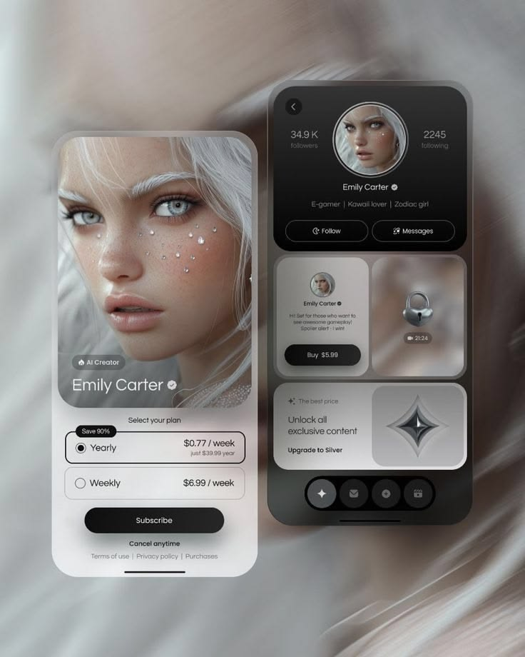
UI/UX Design Trends Shaping Mobile Apps in 2026
As we move through 2026, several key trends are defining the future of mobile app UI/UX design. These are not fleeting aesthetic fads; they are fundamental shifts in how we approach interaction, accessibility, and personalization. Below are the trends that matter most.
AI-Powered Personalization
Artificial intelligence has moved beyond being a buzzword and become a core component of modern app design. Today's apps are increasingly capable of adapting their interfaces to individual users in real time. A fitness app might rearrange its home screen to prioritize cardio workouts for a runner and strength training for a weightlifter. A news app might adjust its typography and layout based on reading patterns observed over time.
This trend goes beyond simple content recommendations. It is about interface personalization — the app itself changes shape, hierarchy, and even navigation structure to match how a specific user interacts with it. Designers are now tasked with creating flexible systems that can gracefully adapt without feeling disjointed or unpredictable.
The challenge lies in maintaining consistency. An interface that changes too much can become disorienting. The best implementations strike a balance: familiar core navigation and structure, with personalized content and subtle layout adjustments that enhance rather than disrupt the user experience.
Minimalism with Purpose
Minimalism in app design is not new, but its expression has evolved. The stripped-down, almost sterile interfaces of the early 2020s have given way to a warmer, more intentional minimalism — one that removes clutter without removing personality.
This trend is driven by a simple truth: users are overwhelmed. The average person has dozens of apps on their phone, each competing for attention. Apps that respect the user's cognitive load by presenting only what is necessary, when it is necessary, stand out.
Key characteristics of this new minimalism include generous white space, restrained color palettes with one or two accent colors, and typography that does the heavy lifting of communication. Buttons and interactive elements are clearly signaled without being visually noisy. Decorative elements are used sparingly and only when they serve a functional or emotional purpose.
The rise of progressive disclosure — revealing information and options only as the user needs them — is a central part of this trend. Instead of dumping every feature onto the home screen, apps guide users through a journey, presenting the right controls at the right moment. This makes apps feel simpler even as they become more powerful.
Dark Mode as a Design Starting Point
Dark mode has transitioned from an optional feature to a design starting point. More users now prefer dark interfaces, and apps designed with dark mode as the primary experience tend to feel more modern and immersive. Designers are no longer simply inverting light-mode color schemes; they are creating purpose-built dark interfaces with carefully considered contrast, depth, and color.
In dark mode, elevation and depth are communicated through subtle brightness variations rather than drop shadows. Surfaces are layered with different shades of dark gray, creating a sense of spatial hierarchy that feels natural on OLED screens where true blacks save battery and look stunning.
Color usage in dark mode has also evolved. Instead of saturated, neon accents that vibrate against dark backgrounds, designers are using softer, desaturated colors that maintain readability while creating visual interest. Gradients are used sparingly to add warmth and dimension without overwhelming the interface.
Microinteractions That Communicate
Microinteractions — the small, momentary animations and feedback loops that occur when a user performs an action — have become a hallmark of polished app design. In 2026, these interactions are more sophisticated and more purposeful than ever.
A well-designed microinteraction does more than look nice; it communicates. A heart icon that animates when tapped confirms that a like was registered. A pull-to-refresh gesture that morphs into a loading spinner tells the user that content is being updated. A form field that gently shakes when submitted with invalid data provides immediate, non-intrusive feedback.
The trend is toward natural, physics-based motion. Animations that mimic real-world behavior — springs, bounces, momentum — feel more intuitive than linear, mechanical movements. Design tools have made it easier to create these nuanced animations, and users have come to expect this level of polish from high-quality apps.
The key principle is restraint. Microinteractions should be quick (typically under 300 milliseconds), subtle, and functional. An animation that calls too much attention to itself or slows down the user's workflow is a distraction, not a delight.
Accessibility by Default
Accessibility is no longer a checkbox at the end of the design process. It is a foundational consideration that informs every design decision from the first wireframe. This shift is driven by both ethical imperatives and practical realities: accessible apps are simply better apps, usable by more people in more situations.
Modern app design prioritizes inclusive design — creating interfaces that work for users with a wide range of abilities, devices, and environments. This means ensuring sufficient color contrast not just for users with visual impairments, but for anyone using a phone in bright sunlight. It means designing touch targets that are large enough not just for users with motor impairments, but for anyone using a phone with one hand while walking.
Dynamic type support is now expected. Users who prefer larger text should be able to scale an app's typography without breaking the layout or losing content. Designers are building fluid type systems that gracefully adapt to user-selected font sizes.
Voice interfaces and screen reader compatibility are also becoming standard considerations. Every interactive element should have a meaningful label, and the app's navigation should be logical when experienced non-visually.
Cross-Platform Consistency with Platform Identity
The debate between designing for iOS conventions versus Android conventions has matured. Today's best apps achieve a delicate balance: they feel consistent across platforms while still respecting each platform's native design language and interaction patterns.
This means that core branding, content structure, and key interactions are unified across iOS and Android. But navigation patterns, button shapes, transition animations, and system-level components adapt to each platform's conventions. An iOS user expects certain gestures and interface patterns; an Android user expects others. Ignoring these expectations creates friction.
Design systems are increasingly built to be platform-aware. Components have shared core styles but platform-specific variants. This approach reduces design and development overhead while ensuring that the app feels native on every device.
Conclusion
The trends shaping mobile app UI/UX design in 2026 share a common thread: they are all about creating more human, more adaptable, and more respectful experiences. AI personalization adapts to the individual. Minimalism respects cognitive load. Dark mode and microinteractions create emotional resonance. Accessibility ensures that no one is excluded. Cross-platform design meets users where they are.
What matters most is not chasing every trend, but understanding the principles behind them and applying them thoughtfully to the specific needs of your product and your users. The best-designed apps are not the ones that look the most trendy — they are the ones that feel effortless, that anticipate the user's needs, and that fade into the background while the user accomplishes what they came to do.
As technology continues to evolve, these principles will remain constant. The tools, platforms, and visual styles will change, but the goal of UI/UX design stays the same: to create mobile experiences that are useful, usable, and genuinely delightful.




