
.jpg)
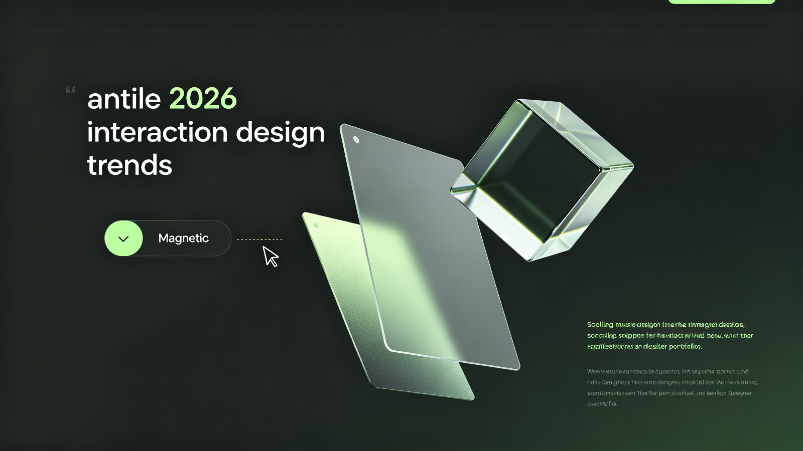
Scroll through Dribbble and Awwwards lately and you'll start seeing the same patterns. Not another "morphism" — concrete interaction choices that keep repeating across award-winning sites. Let me break down the ones worth noticing.
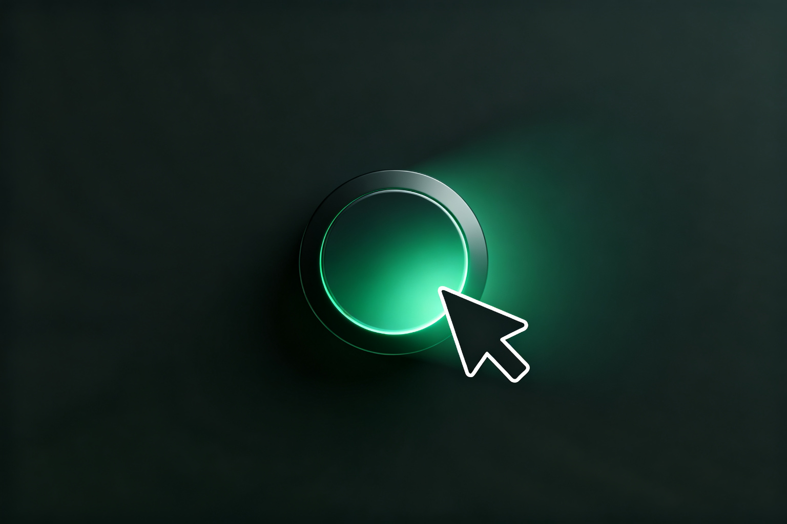
The button doesn't just sit there. When your cursor gets close, it leans toward you — not snapping all the way over, just a subtle offset that makes it feel alive.
This started showing up around 2024 and now it's everywhere on designer portfolios. The idea is simple: a button that responds to proximity feels more present than a static rectangle. But most implementations feel too aggressive. The good ones have delay — the button lags behind the cursor by a beat, like it has inertia.
Instead of a whole block of text fading in, the new pattern is word-by-word or keyword highlighting as you scroll. The line you're reading lights up, the rest dims.
This is better than the old fade-in because it actually guides the eye. But it only works if the content is worth guiding someone through. Slap it on generic marketing copy and it just looks like you're trying too hard.
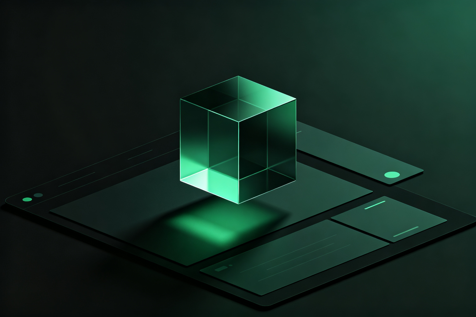
Not a full-screen 3D scene — a single 3D object sitting inside a flat page. A rotating logo, a floating product, a glass geometric shape. It lives next to images and icons, not instead of them.
This is the interesting one because it blurs the line between 2D and 3D. The key is relevance: the 3D element should be expressing something, not just filling space.
Move your mouse over a card and it tilts like a physical card in your hand. This started on Apple product pages and spread everywhere.
It works when the card contains something spatial — a product shot, a 3D model — because tilting lets you see different angles. It doesn't work on text-only cards. Tilting a paragraph doesn't add information. It just adds motion.
Almost nobody talks about this, but a few new sites have started adding it. A soft click when you hover a button. A quiet confirmation when you submit a form.
Sound is the most underrated interaction layer. Everyone does visual feedback. Almost no one does audio. But when done right — not background music, just short, confirmatory clicks like pressing a physical button — it makes the interface feel tangible.
These trends share one thing: interfaces are getting more physical. Buttons respond to the cursor. Cards tilt. 3D objects float. They're all simulating the physical world.
This is the opposite direction from flat design. Flat stripped away material and skeuomorphism. Now we're swinging back — but not to 2000s-style glossy buttons. We're using modern technology to do subtler, more precise physical feedback.
Most people will stop at "looks cool." The ones who connect the interaction to what the content actually does — those are the ones moving things forward.




