
Last year when Aespa released Savage, I stopped scrolling on Instagram. The cover was chrome metal type—liquid-looking letters reflecting multi-directional highlights against a dark background, as if the word were bursting through some liquid threshold. At first I assumed it was another echo of the Y2K revival. But later I realized this treatment had developed its own grammar in Korean design. It wasn’t nostalgia. It was doing something different.Korean design circles have a word for it: “쇠맛”—literally “the taste of metal.” It describes a cold, reflective, metallic visual experience. In 2024, it spread from K-pop stages into fashion, beauty, even kitchen spaces. Behind it is the Y3K trend—not nostalgia for 2000, but an imagination of 3000.In Western design, chrome type is usually filed under Y2K revival. In Korea, it carries something else. To understand why, you need to understand a tension Korean design has been negotiating for years.

Korean design has a built-in tension. On one hand, the traditional aesthetic of 여백 (yeobaek)—treating empty space as an active design element rather than a container waiting to be filled—has deeply shaped Korean spatial, interior, and editorial design. Korean artists call this space 여백; it doesn’t mean blankness, but “intentionally left emptiness.” Philosopher Byung-Chul Han argues that true beauty exists in this imperfection, in empty space.On the other hand, Korea has one of the world’s most advanced mobile network infrastructures, and Hangul’s geometric simplicity makes it naturally suited to being treated as graphic form. K-pop designer Phillip Kim put it precisely: “K-pop design is about visualizing the artist’s message so fans can understand and resonate with it intuitively.”The result: when Korean designers work on digital products, they tend to grab attention first with a strong visual or a graphic treatment of type, then let information follow. This is quite different from Japanese design’s logic of “balance between information and visuals.” Japanese design pursues order and hierarchy; visuals serve clarity. Korean design is more willing to let the visual speak first, with text following.Chrome type sits exactly at the intersection of this tension. It’s heavy enough to be the visual lead. It’s cold enough not to pull the page toward noise the way high-saturation warm colors do. Chrome’s silver-gray tones, mirror reflections, and sharp highlights carry a restrained precision. That matches Korean design’s pursuit of “refined but not loud.”
To answer “why Korean designers chrome their type,” you first need to separate it from its Western cousin.Western Y2K chrome type was a product of the low-resolution screen era. Designers faked metal with gradients and filters; the monitor’s limited color space “did the other half of the work.” Chrome type then was a compromise under technical constraints: if the screen could only show limited gradations, push it to the extreme and let the metal come from distortion itself.Korean chrome type today exists under completely different technical conditions. In its feature on the K-pop design machine, It’s Nice That pointed to Aespa’s Savage album cover as the starting point: chrome letters in a heavy, video-game-like symmetrical composition, “as if bursting from some liquid threshold.” Crucially, this wasn’t Y2K nostalgia. It was a visual translation of Aespa’s virtual world (KWANGYA / Flat)—chrome’s mirror reflection corresponds to the boundary between virtual and real.In other words, Western Y2K chrome was an aesthetic choice under technical limitation; Korean chrome is a conceptual expression after technical maturity. The former is “this is all we can do.” The latter is “we choose to do this.” Korean designers use chrome not because screens can’t render finer metal reflections, but because chrome’s coldness, precision, and “non-human” quality serve K-pop’s virtual idol narrative.
The spread of chrome type in Korea follows a fairly clear line.Aespa is a starting point, not the endpoint. Seventeen’s “Right Here” world tour visuals, designed by Phillip Kim, used custom lettering with his signature typographic style and grotesque ornament. Kim emphasizes “intuitive understanding” as the core of K-pop design—fans should feel the artist’s message the moment they see the letters. Chrome type’s visual weight and coldness serve that intuitive delivery.Gentle Monster is a useful transitional case. The Korean eyewear brand’s website is built on a monochrome system, using Light weight 350 as the base UI font. It doesn’t chrome its type directly; instead, it unifies the entire page under a logic of “metalness”—mirror reflections in product photography, precision in web interactions, a restrained relationship between type and space. This goes further than chrome type: it turns chrome from a text effect into a brand’s spatial language.Another direction comes from Korean beauty’s Y3K trend. Liquid chrome, holographic coatings, “icy blue shimmer”—these elements appear densely in Korean beauty visuals. The core shift in Y3K aesthetics is how light is handled: traditional “glass skin” absorbs light; Y3K skin reflects it—“the whole face reads like a rendered surface, not naturally born skin.” That shift from absorption to reflection is identical to chrome type’s optical logic. Beauty brands’ e-commerce detail page headlines began using low-saturation silver-gray gradients against dark backgrounds, but with contrast deliberately suppressed—chrome as implication, not declaration. In interfaces, chrome is a texture marker, not a visual manifesto.
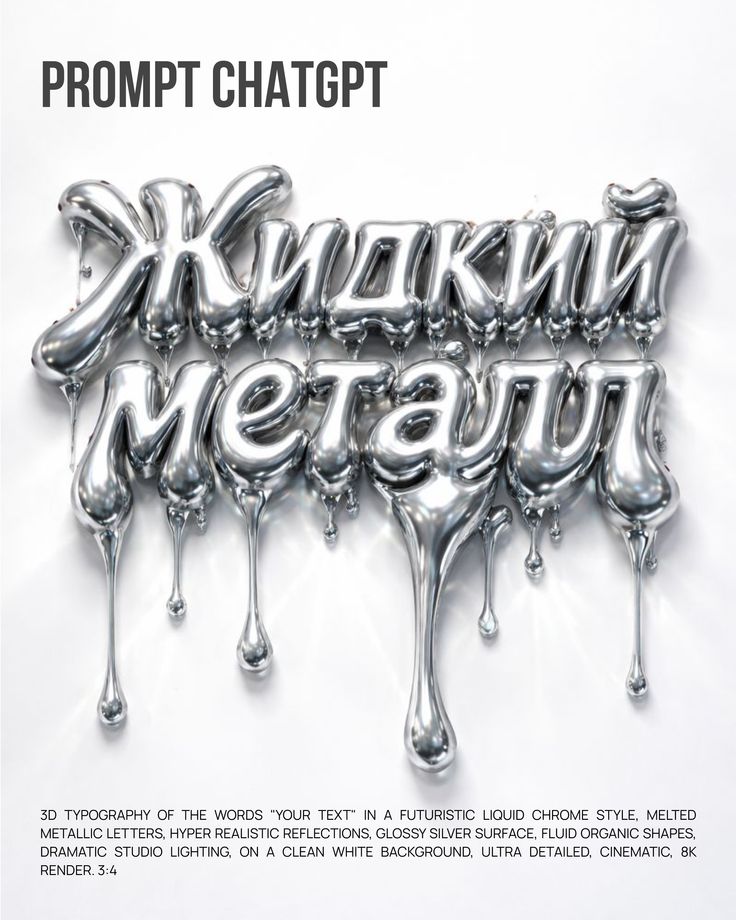
If you want to reproduce Korean chrome type in Figma or Photoshop, the core isn’t a filter. It’s layering light.Chrome’s optical logic: ambient light hits from one direction, forming a sharp highlight band on the type surface. On either side of the highlight is midtone, then a fast transition to deep shadow. Because chrome’s reflectance is extremely high, the transition between highlight and shadow is very narrow—almost a hard edge. That’s why chrome type feels “cold”: no soft gradients, only rapid switches between light and dark.In practice, Korean designers often start with an extra-wide typeface as a base, then stack three gradient layers. The first defines the overall silver-gray midtone. The second places a tilted highlight band, angled to simulate the direction of an environmental light source. The third adds an extremely fine chromatic shift at the edges—usually a faint magenta-to-cyan gradient, simulating the interference color real chrome plating produces at certain angles. The final step is the background: chrome type is born for dark backgrounds. Deep black, dark charcoal, or near-black slate maximizes the reflective contrast of mirror chrome.This operation is used repeatedly in Korea not because it’s novel, but because it serves the contradiction Korean design has been negotiating all along. Chrome’s optical features—sharp highlight, narrow transition, deep shadow—mean it can only be a “point” on the page, never a “surface.” It naturally belongs at the center of empty space, as the only element speaking loudly. Korean design’s respect for 여백 and digital products’ need for 직관적 전달 (intuitive delivery) find an intersection in chrome type: use the least metal, occupy the most attention.
Chrome type has a problem that’s rarely discussed: its contrast is unstable.Chrome’s visual character is a rapid sequence of highlights and shadows, meaning the same word can present drastically different contrast depending on where it sits on the page. WCAG AA requires a minimum contrast ratio of 4.5:1 for all text (large text—18px and above, or 14px bold—can be relaxed to 3:1). But certain areas of chrome type—especially the transition zones around highlight bands—can easily fall below that threshold.Korean designers typically respond by using full-strength chrome only in display typography. Titles, brand names, album cover key visuals—places where unstable contrast is acceptable because users can understand through context. Once chrome enters functional text—navigation, buttons, form labels—it’s downgraded to a low-saturation silver-gray flat color, retaining a hint of tone but losing the mirror reflection. That’s why chrome type in Korean digital product interfaces rarely appears in areas that require prolonged reading.Chrome type is inherently a “high-cost” visual choice. It demands dark backgrounds, and at small mobile sizes it easily loses detail. Korean designers most often use it at a single point on the page: one main headline, one brand name, one core keyword. Everything around it is muted neutrals and clean typography.If the whole page is chrome type, it becomes noise. If there’s no chrome element at all, the page may lack a focal point for the eye. Chrome type in Korean design ultimately does one thing: it uses the least “metal” to say the heaviest thing.




