
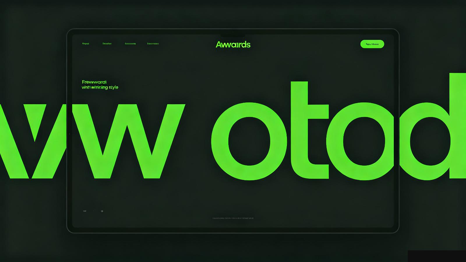
Most websites use the same three fonts: Inter, Montserrat, and maybe Roboto. Set the body at 16px, headings at 32px. Done.
That's not typography. That's default.
It's about hierarchy. It's about making some words huge and some words tiny. It's about mixing a bold serif with a clean sans. It's about using type as the main visual element, not just a way to deliver text.
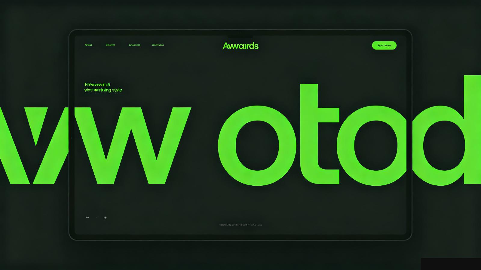
Look at the sites that win awards. They don't have fancy illustrations or 3D animations carrying the design. They have big, confident type. The words are the design.
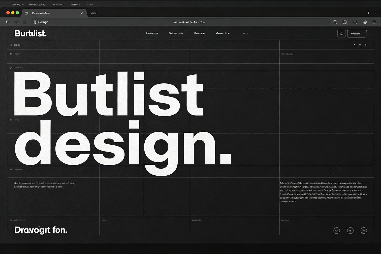
It looks fine. It's readable. It's also completely forgettable.
Good typography has tension. It makes some elements massive and others tiny. It uses different fonts for different voices. It doesn't play it safe.
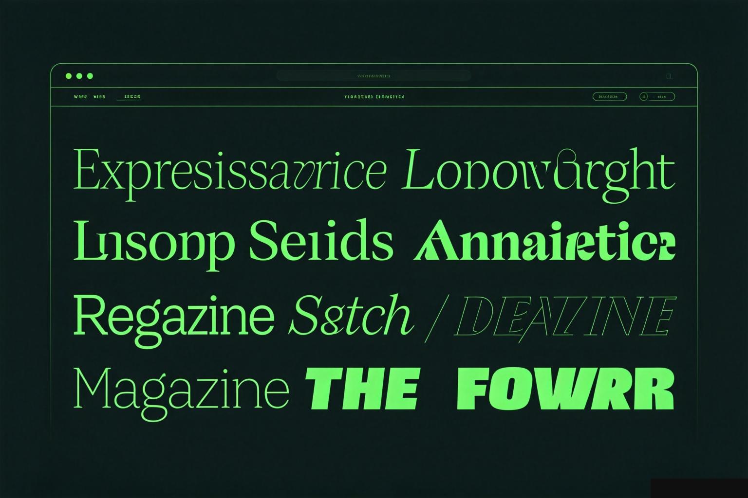
Think of it like a poster. The headline fills the screen. The subtext is small. There's no image — the type itself is the image.
On a website, this means:
This isn't about making everything hard to read. It's about having a point of view.
You can start small: use a different font for your headings. Make your hero text bigger than you think it should be. Let one section have oversized type as a statement.
The point is: when every website uses the same safe settings, doing something intentional stands out.
Good typography doesn't cost anything extra. It's the cheapest upgrade you can make to your design. You don't need new assets, new animations, or a new color palette. Just make your type do more work.




