
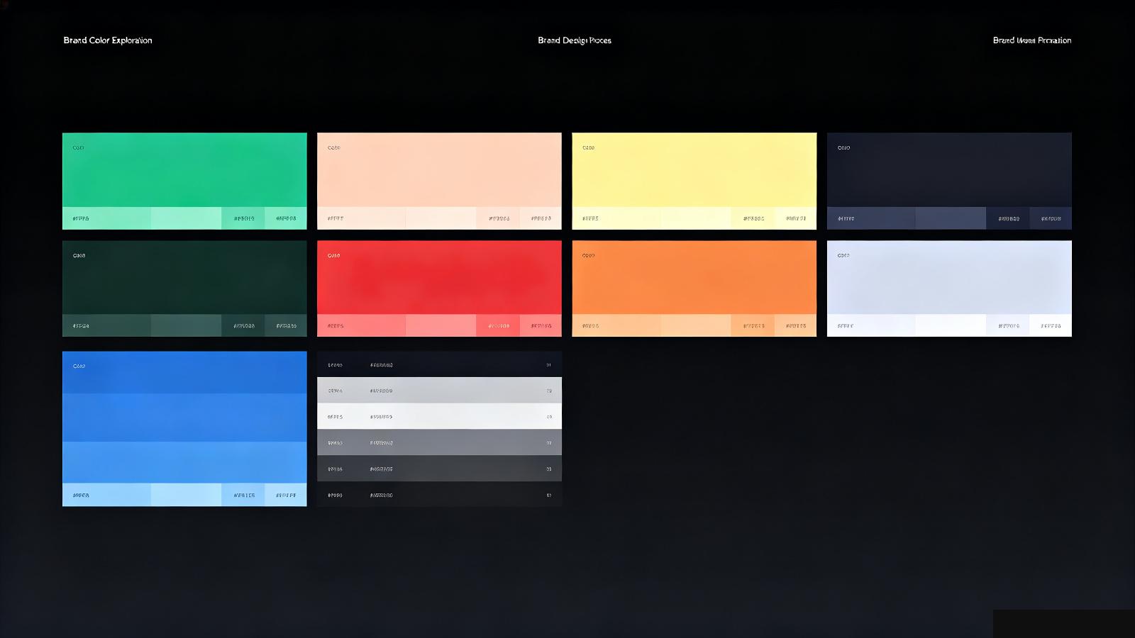
Most people choose a brand color the wrong way. They open a color picker, look at swatches, and ask "what color feels right?"
That's backwards.
Your brand color should come from who you are, not what looks good on a swatch. It's the end result of a brand strategy, not the first decision you make.
Before you pick a color, you need to know:
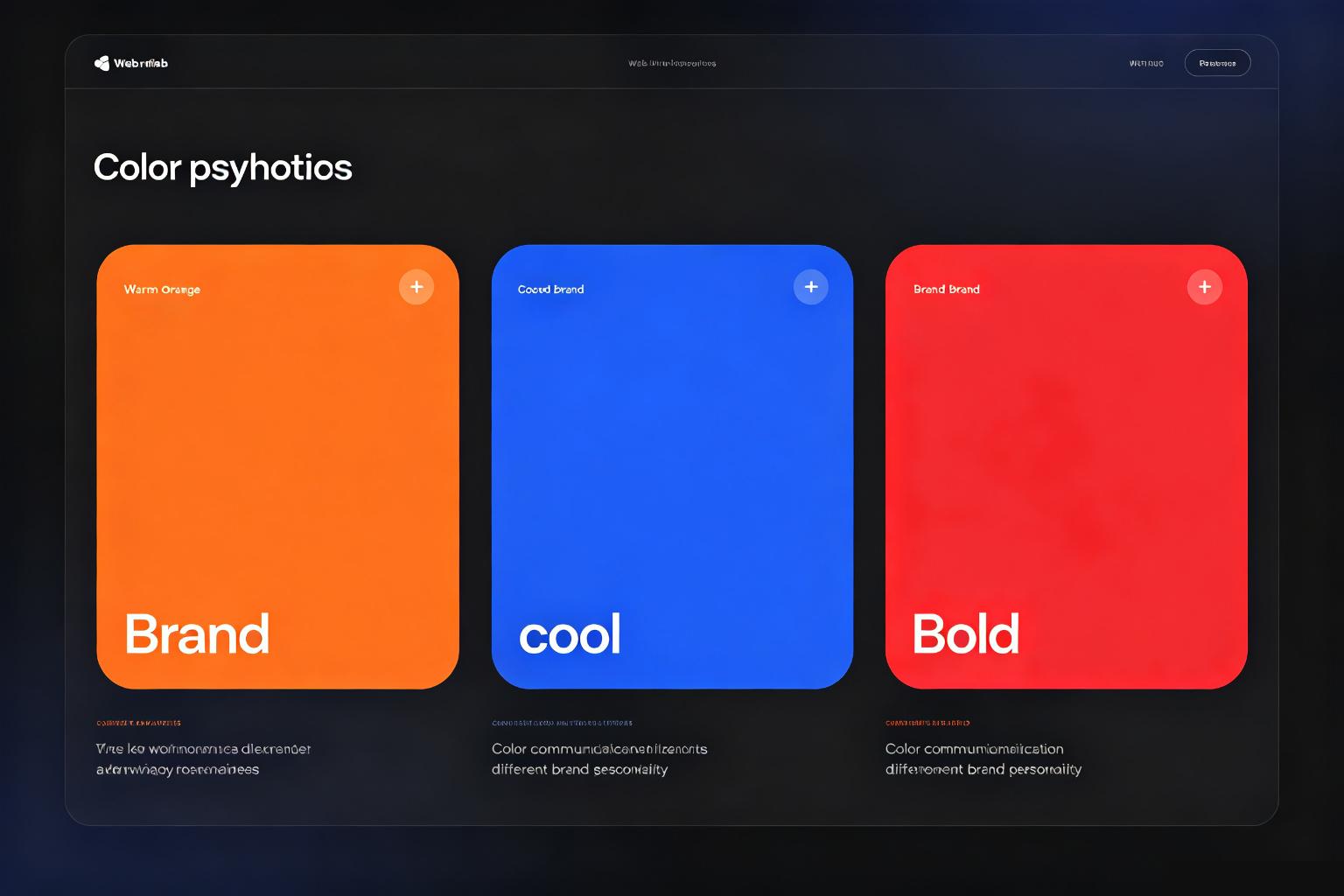
Red means urgency, energy, sometimes anger. Blue means trust, calm, corporate. Green means growth, health, money. Orange means friendly, energetic, affordable.
This isn't a suggestion. It's built into how people perceive color.
If you're a bank, you don't use bright orange. If you're a skate brand, you don't use navy blue. The color tells people what you are before they read a single word.
Look at fintech apps — they're all blue. Look at crypto brands — they're all dark with purple gradients. Look at wellness brands — they're all soft green.
That's not a coincidence. It's because blue signals trust, purple signals tech, green signals health. Brands use these colors because they work.
But here's the thing: when everyone uses the same color, standing out means going against expectations. A fintech brand in red? A children's brand in black? That takes confidence — but it makes you memorable.
Start with personality. Are you bold or calm? Playful or serious? Young or established? Pick three words that describe your brand. Then find colors that match those words.
Look at competitors. If everyone in your space uses blue, either commit to blue and do it better, or pick something that makes you stand out.
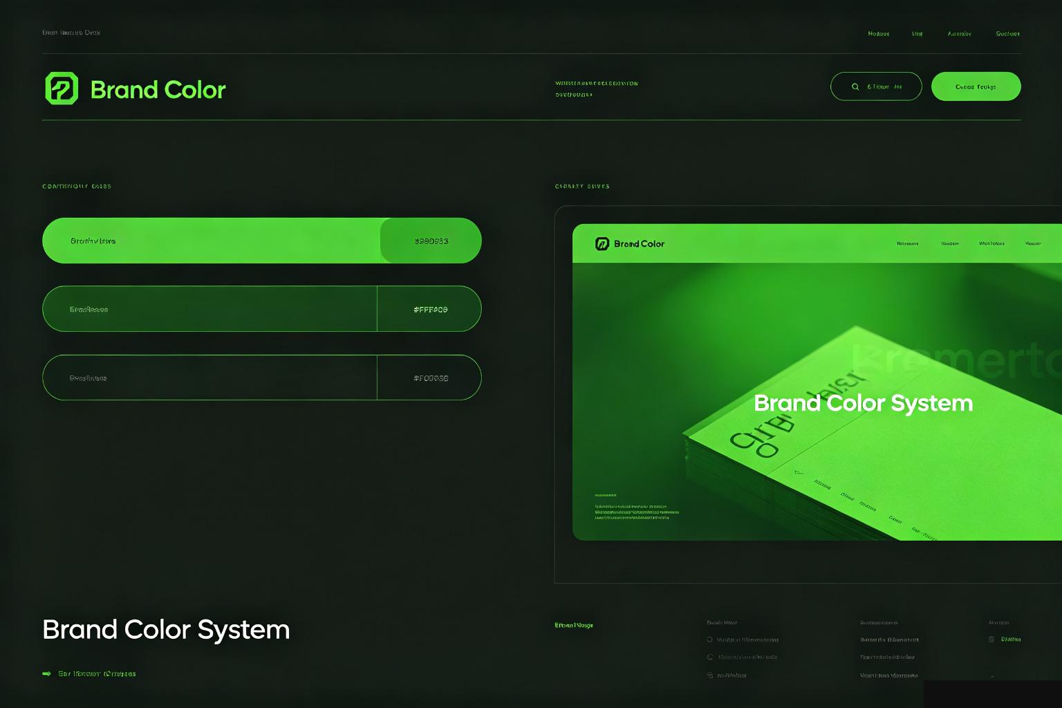
Test it in context. A color on a swatch looks different on a button, on a website, on a business card. Put it in a real layout before you commit.
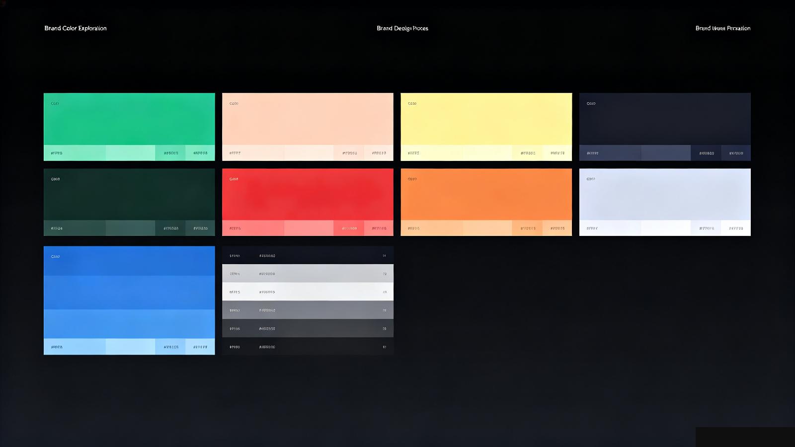
Use it everywhere. A brand color isn't just one hex code. It's a system — the primary color, tints, shades, how it works on dark and light backgrounds, how it contrasts with text.
Your brand color is one of the first things people see. Don't treat it like a design detail. It's a strategic decision that says who you are before anyone reads your content.
Pick it on purpose, not on instinct.




