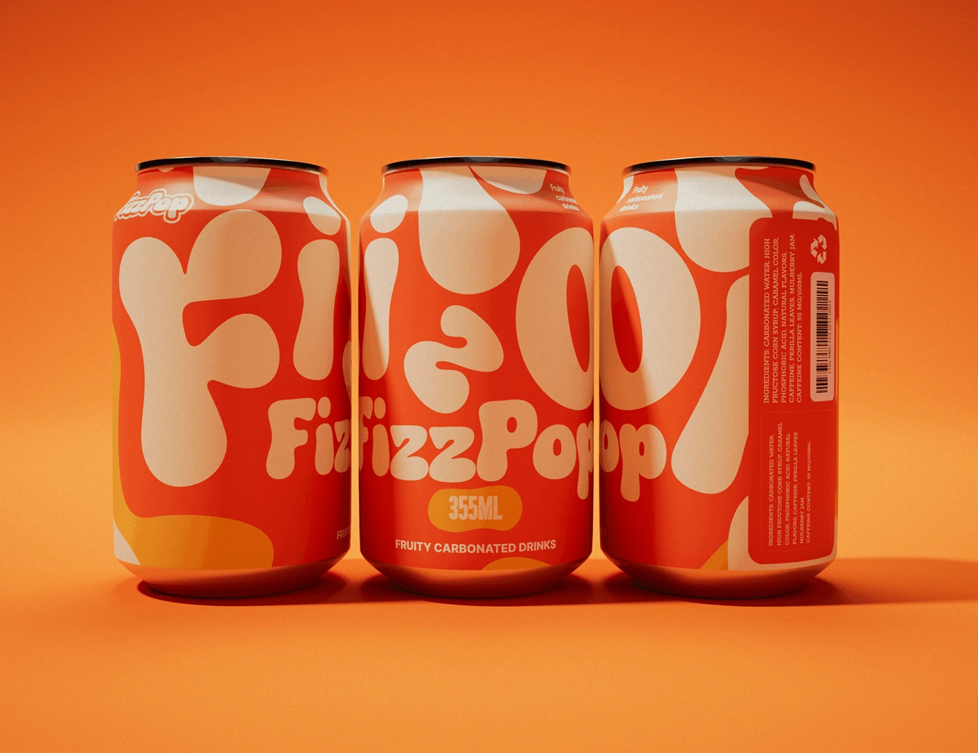
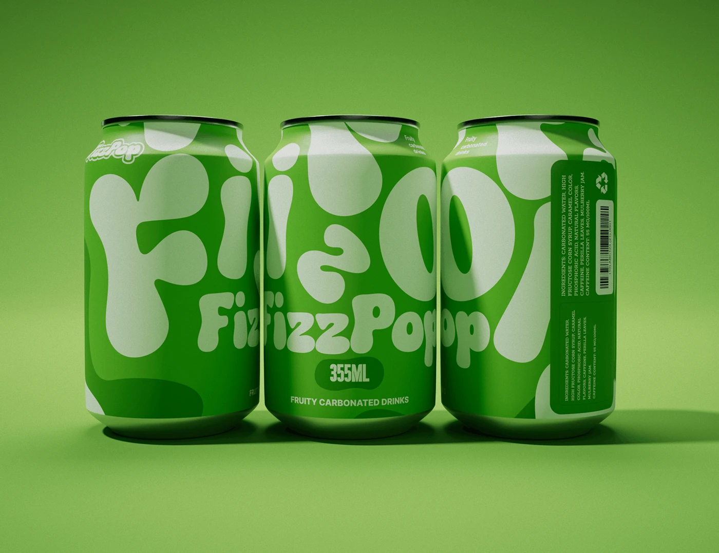
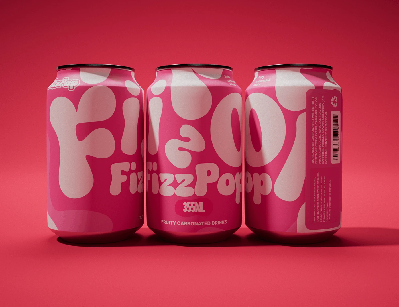
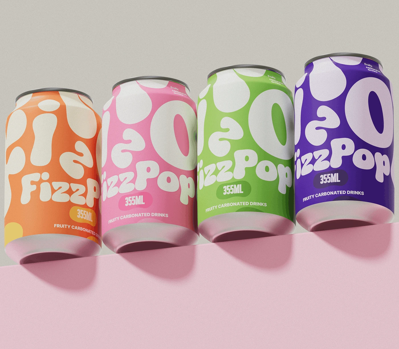
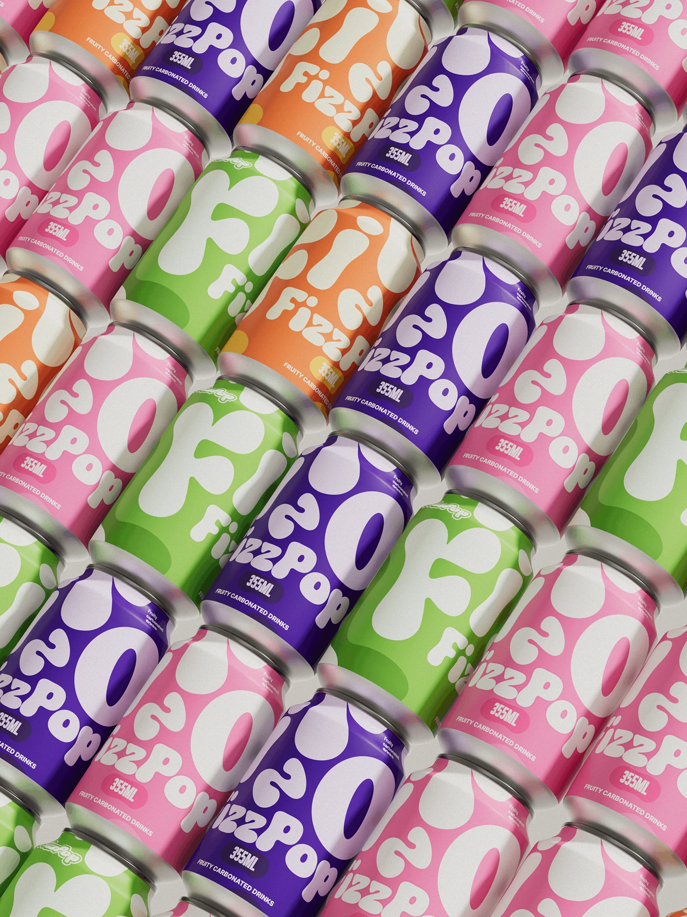
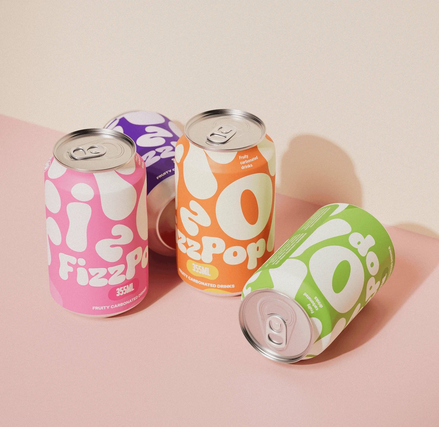
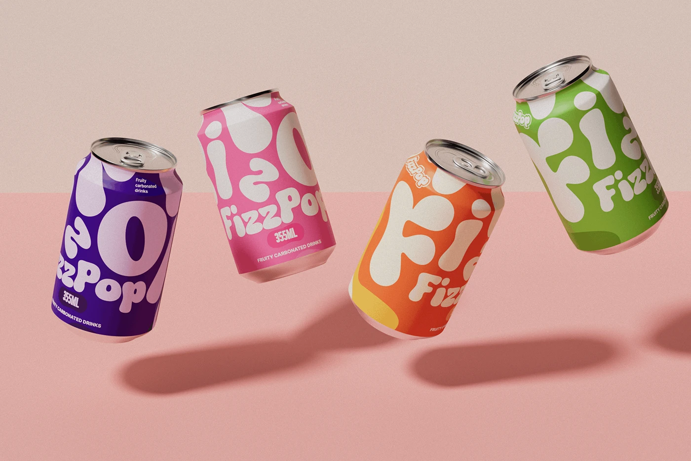
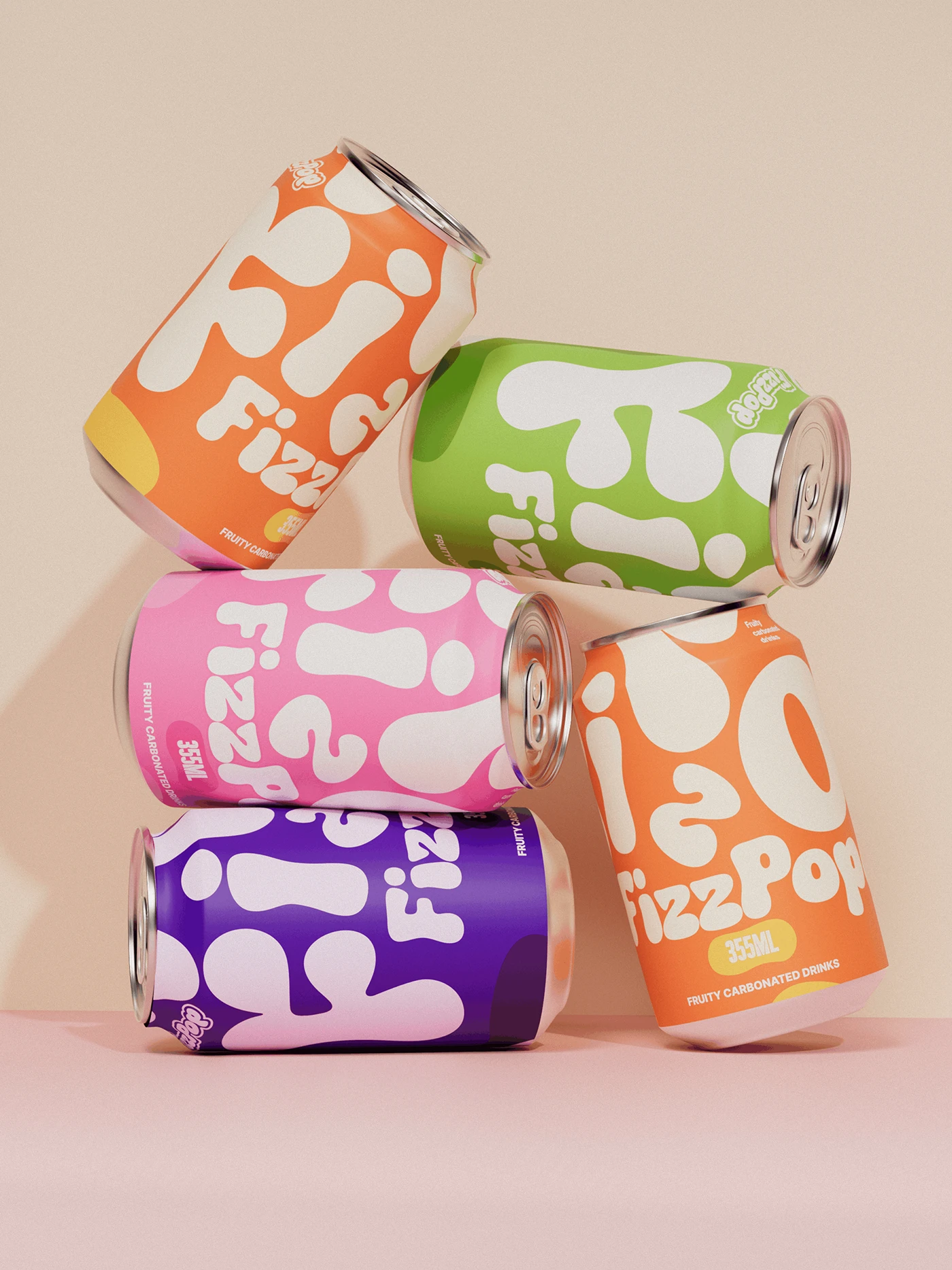
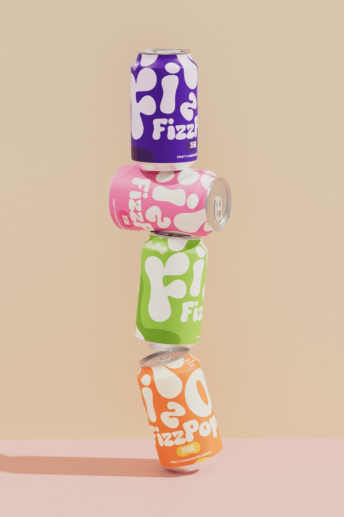
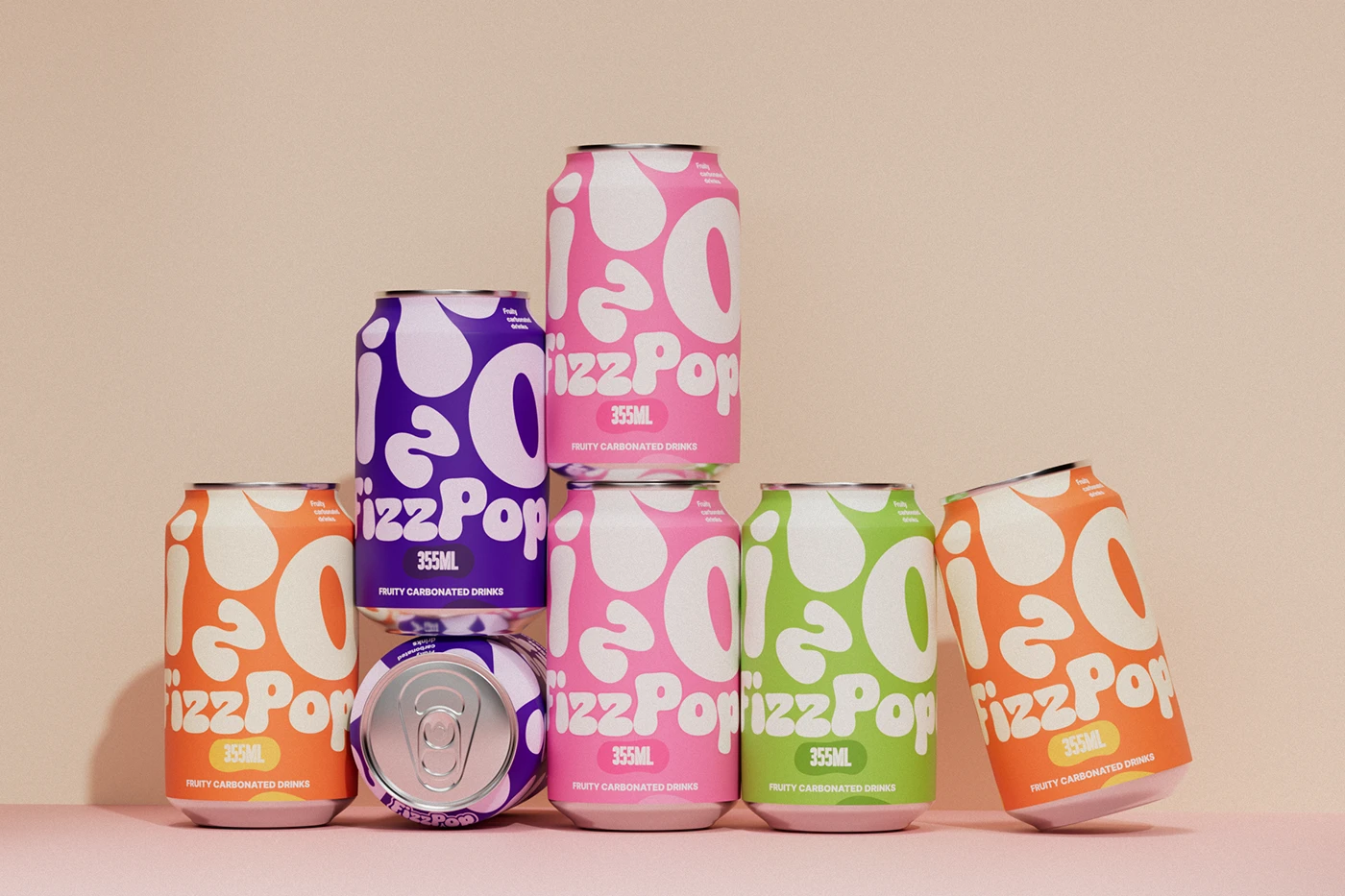
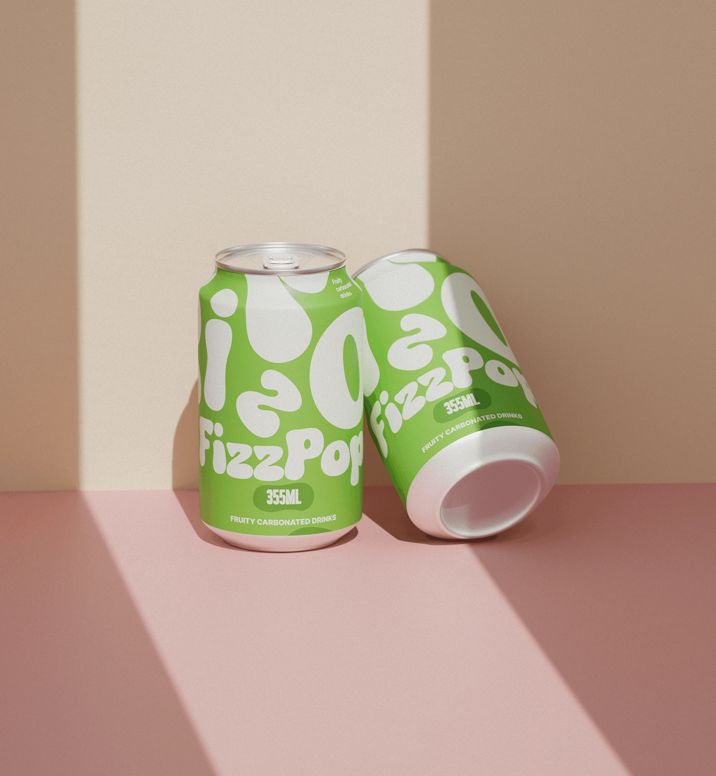
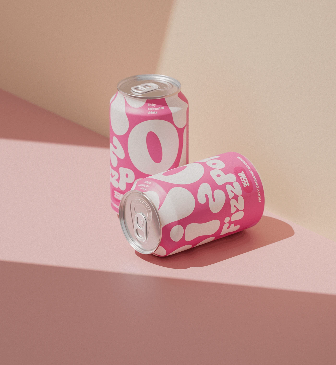
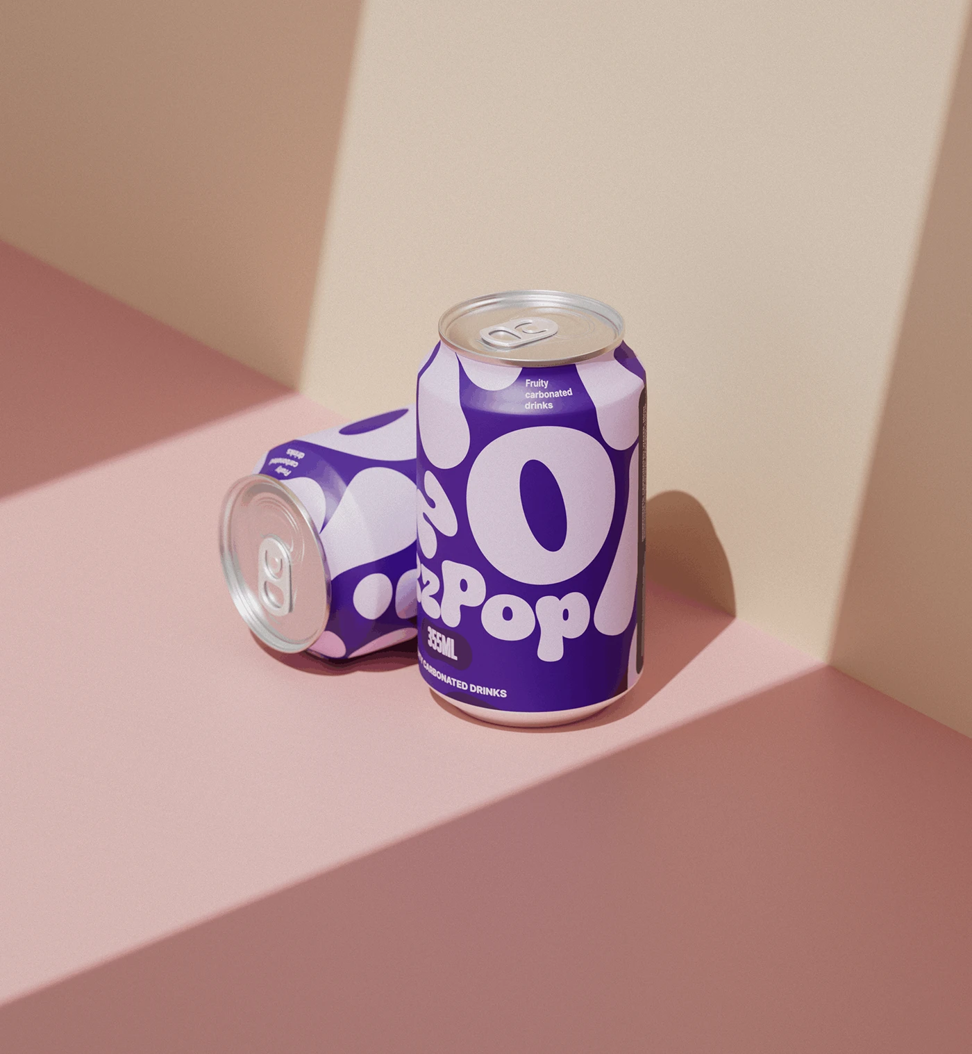
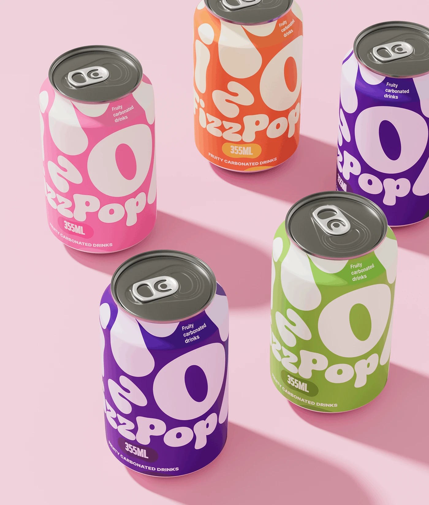
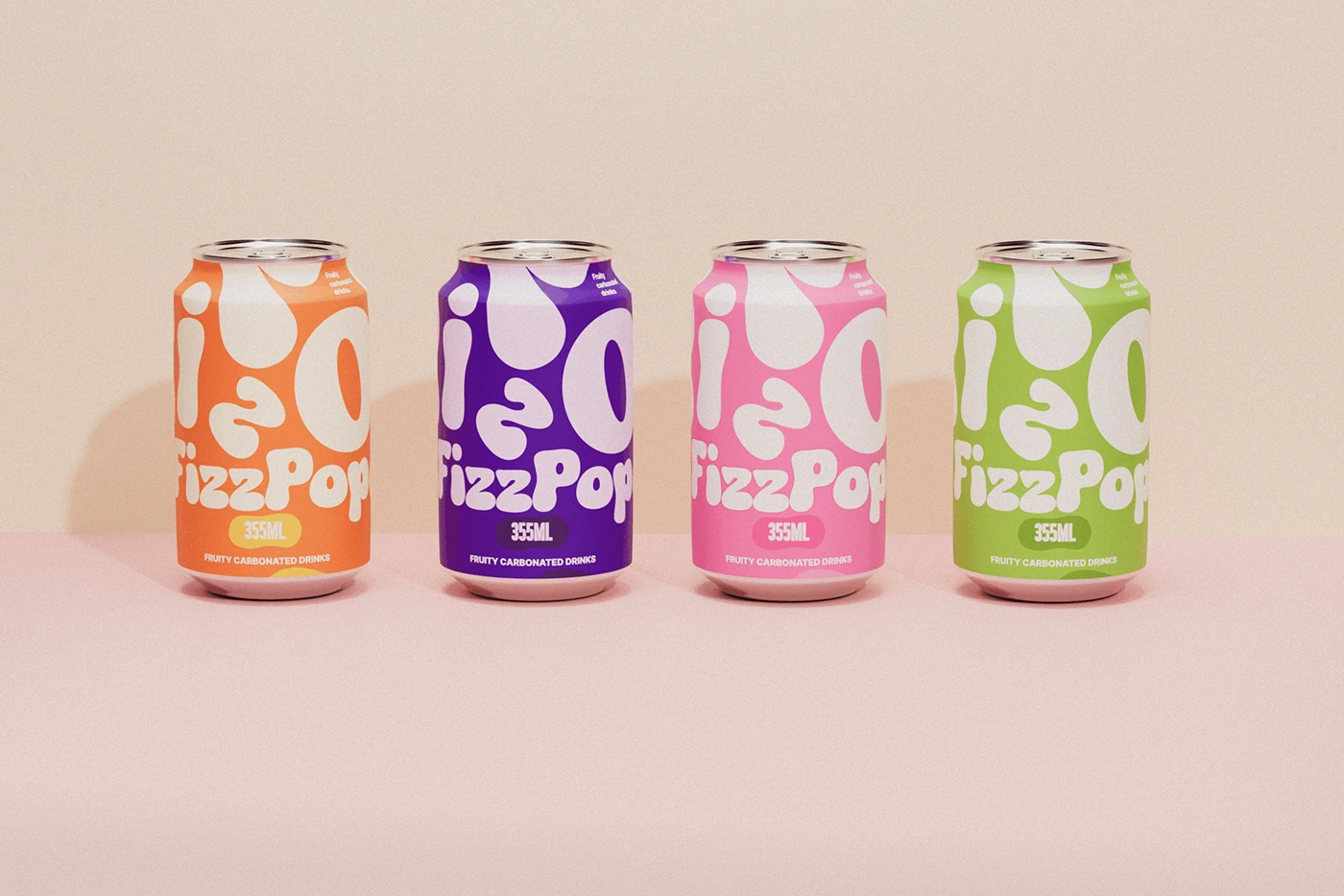
The letters are the decoration. Giant bubbly type wraps around each can — four colors, four flavors, zero fruit illustrations.
FizzPop — Carbonated Drink Packaging Design
Client: FizzPop Services: Packaging Design, Brand Identity, Typography Year: 2025
The Challenge
Soda cans are crowded with graphics. Every brand is putting fruit illustrations, wave patterns, and splash effects on the can. We needed a packaging system that stops you in the fridge aisle without using a single fruit illustration.
The Approach
We let the type do everything.
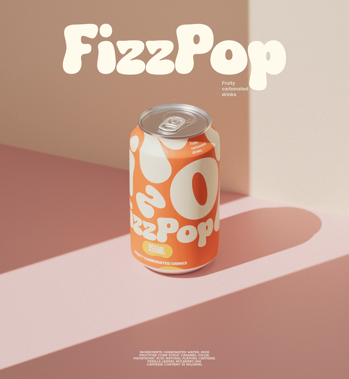
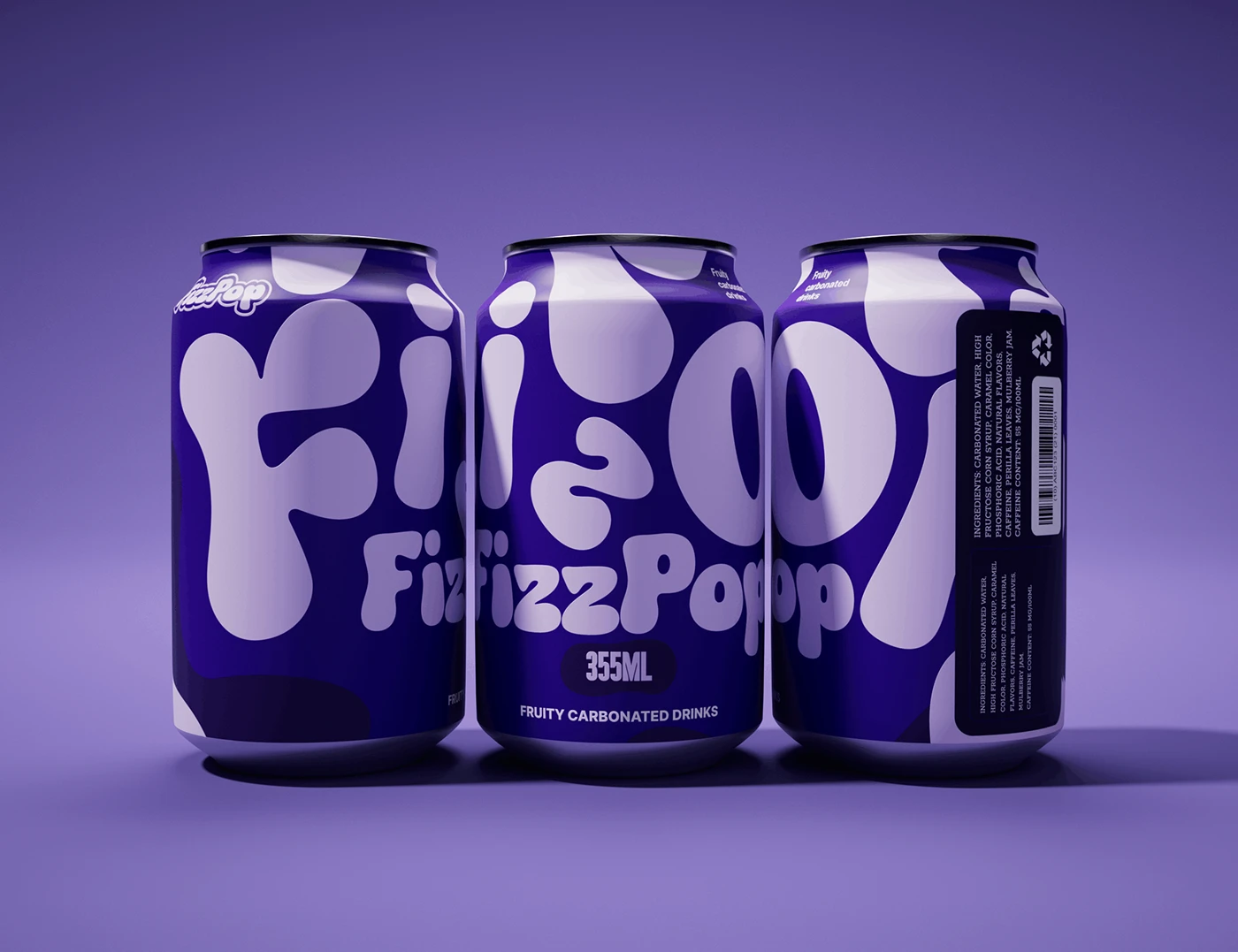
"FizzPop" is built around one idea: bubbles. The letterforms are swollen, rounded, liquid-looking — like carbonation expanding inside the can. We blew the logo up so large it wraps around the entire can. The letters are the decoration. No illustrations, no patterns, no splash graphics.
Four flavors, four colors. That's the whole system.
Visual System
Typography
The display type is custom-drawn — fat, round, and slightly irregular, like letters that have been fizzy-fied. The ascenders and descenders are swollen. The counters (the holes inside letters like O and P) are large and round. It reads as playful but not childish.
Below the giant letters, "FizzPop" repeats in a smaller, cleaner version of the same font. It's the readable version — the giant letters are the art, the smaller text is the information.
Color
Four solid, saturated colors:
Orange — citrus
Pink — strawberry
Green — apple / lime
Purple — grape / berry
Each can is one color. The typography on top is a lighter shade of the same color — creating a monochromatic, high-impact look that pops against standard silver cans.
Layout
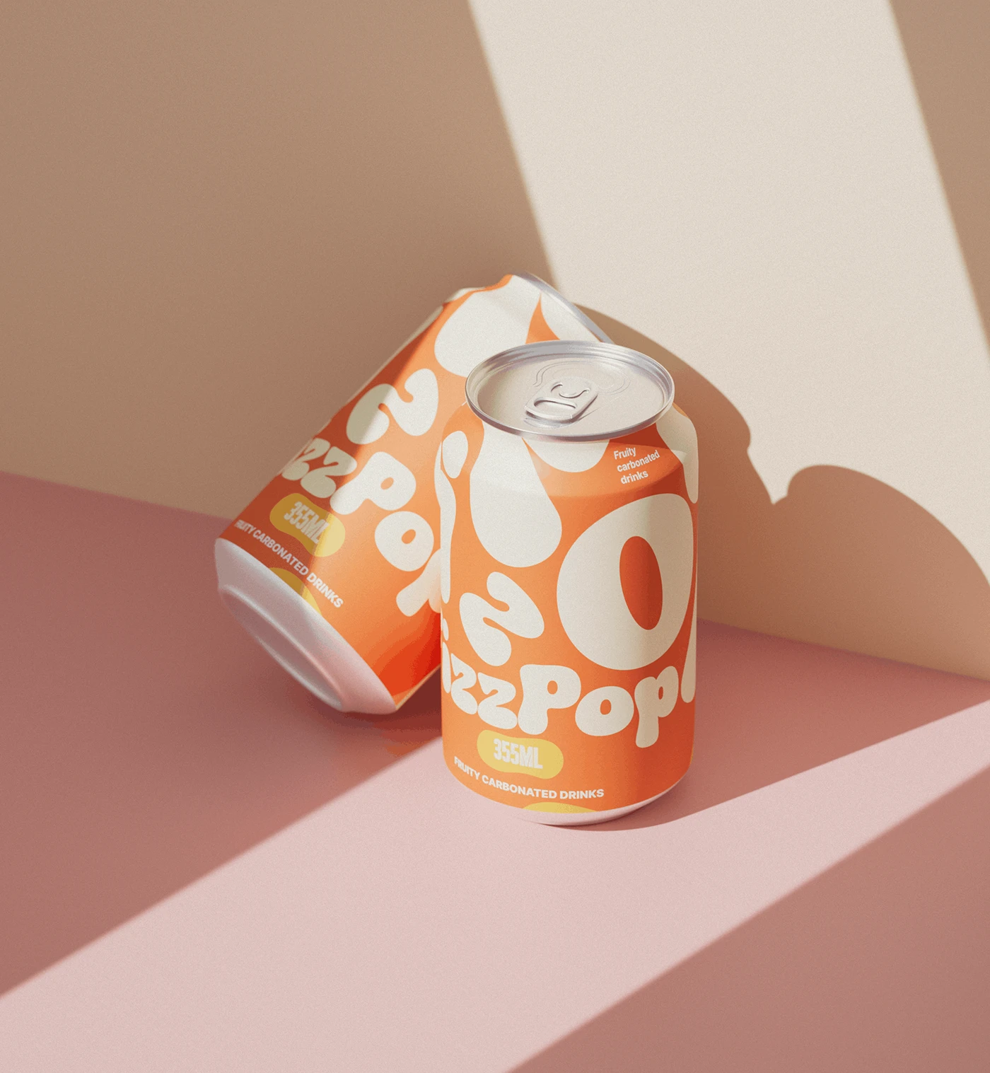
The giant letters wrap around the can. You can read "FIZZ" from one angle and "POP" from another — the logo moves as you turn the can. The 355ml badge sits below in a rounded rectangle. "Fruity Carbonated Drinks" runs along the bottom.
The back panel holds ingredients, barcode, and recycling icons — clean, functional, out of the way.
Why It Works
Shelf impact: Giant type beats fruit illustrations every time. It's the loudest can in the fridge.
Type as decoration: No illustration needed. The letterforms carry the personality.
Range system: Four colors, same typography. Scales to new flavors by just adding a new color.
Young energy: The swollen, bubbly type looks like a bubble about to pop — which is exactly what carbonation feels like.