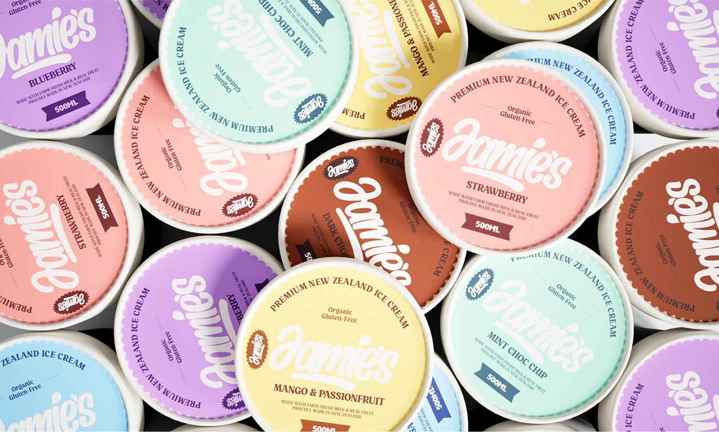
Jamie's — Ice Cream Packaging Design

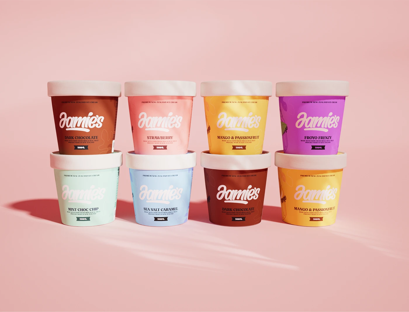
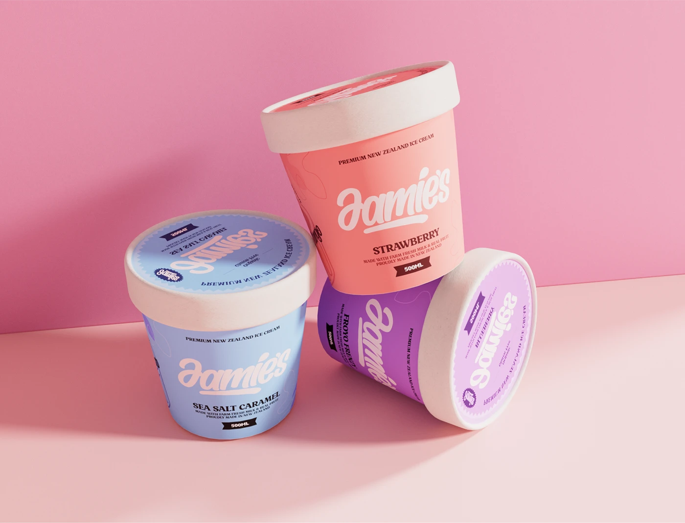
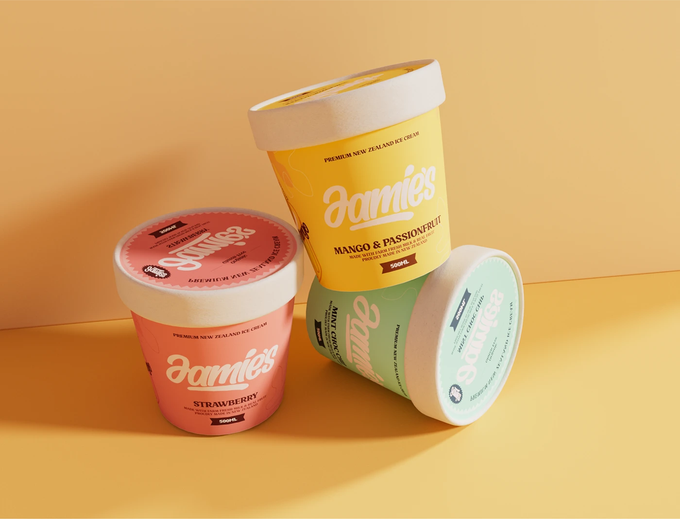
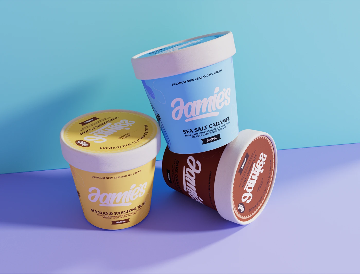
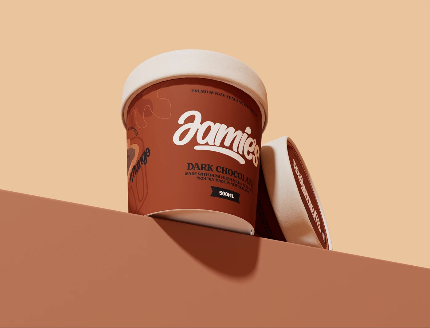
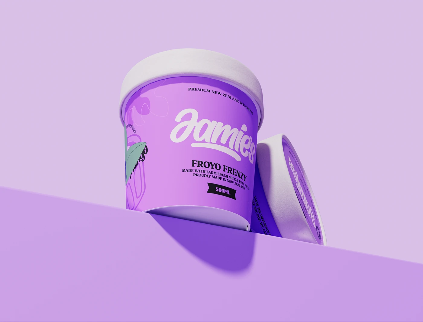
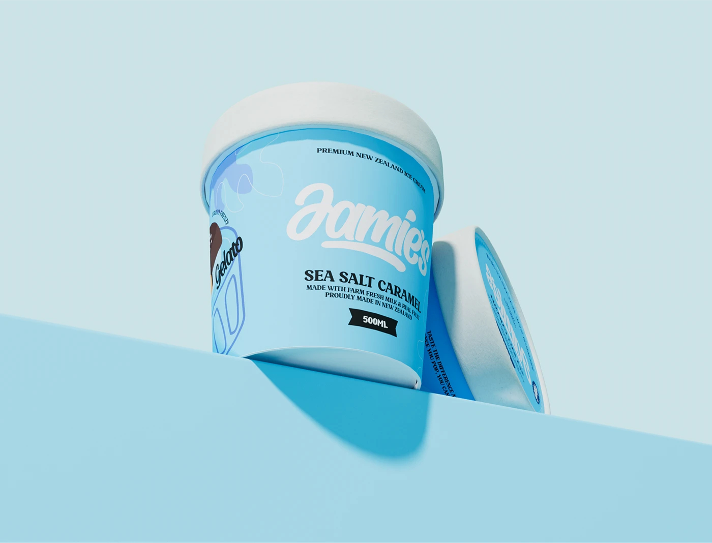
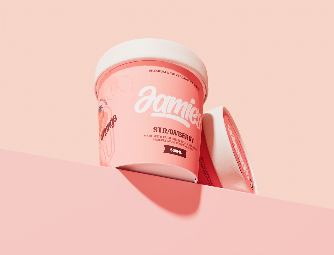
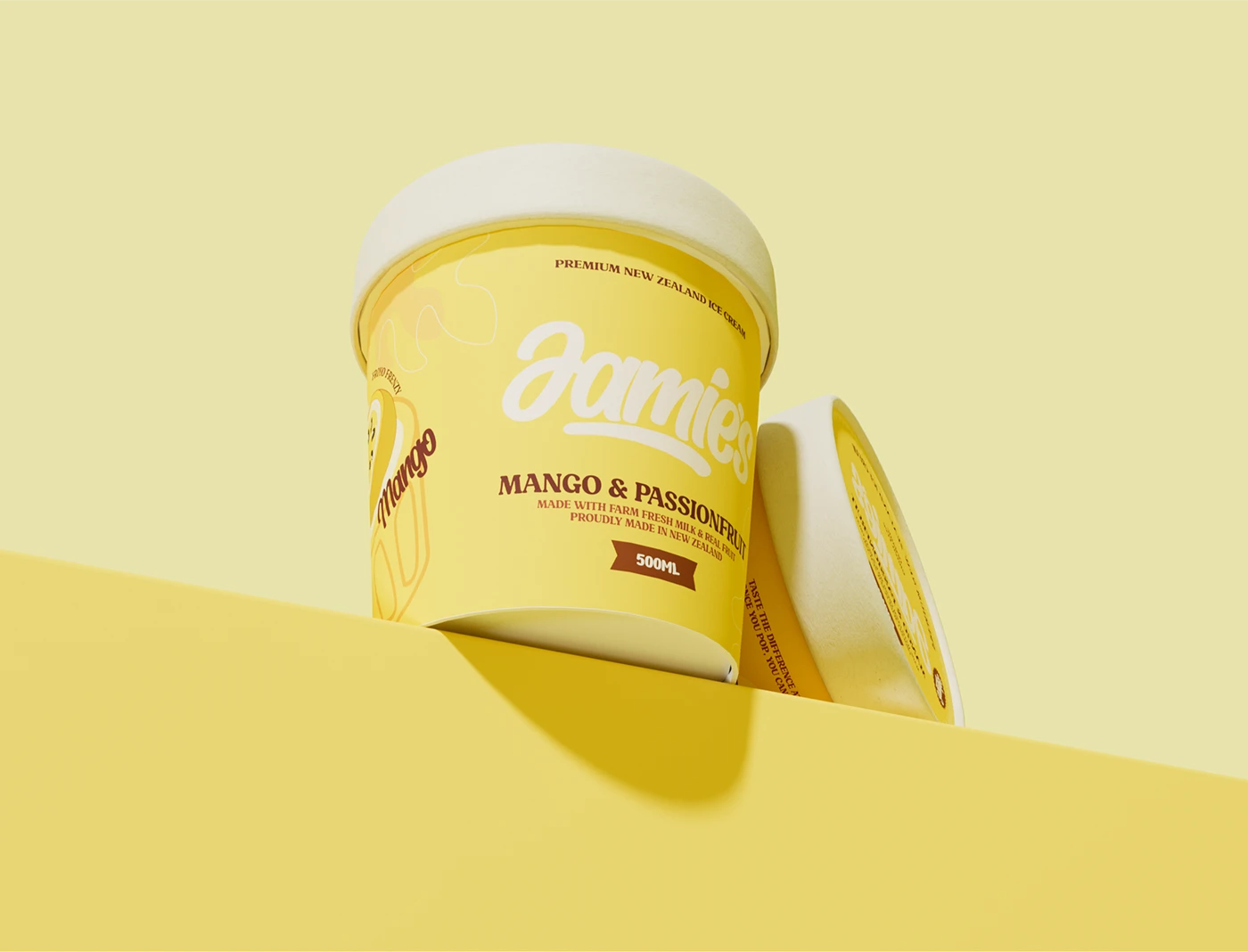
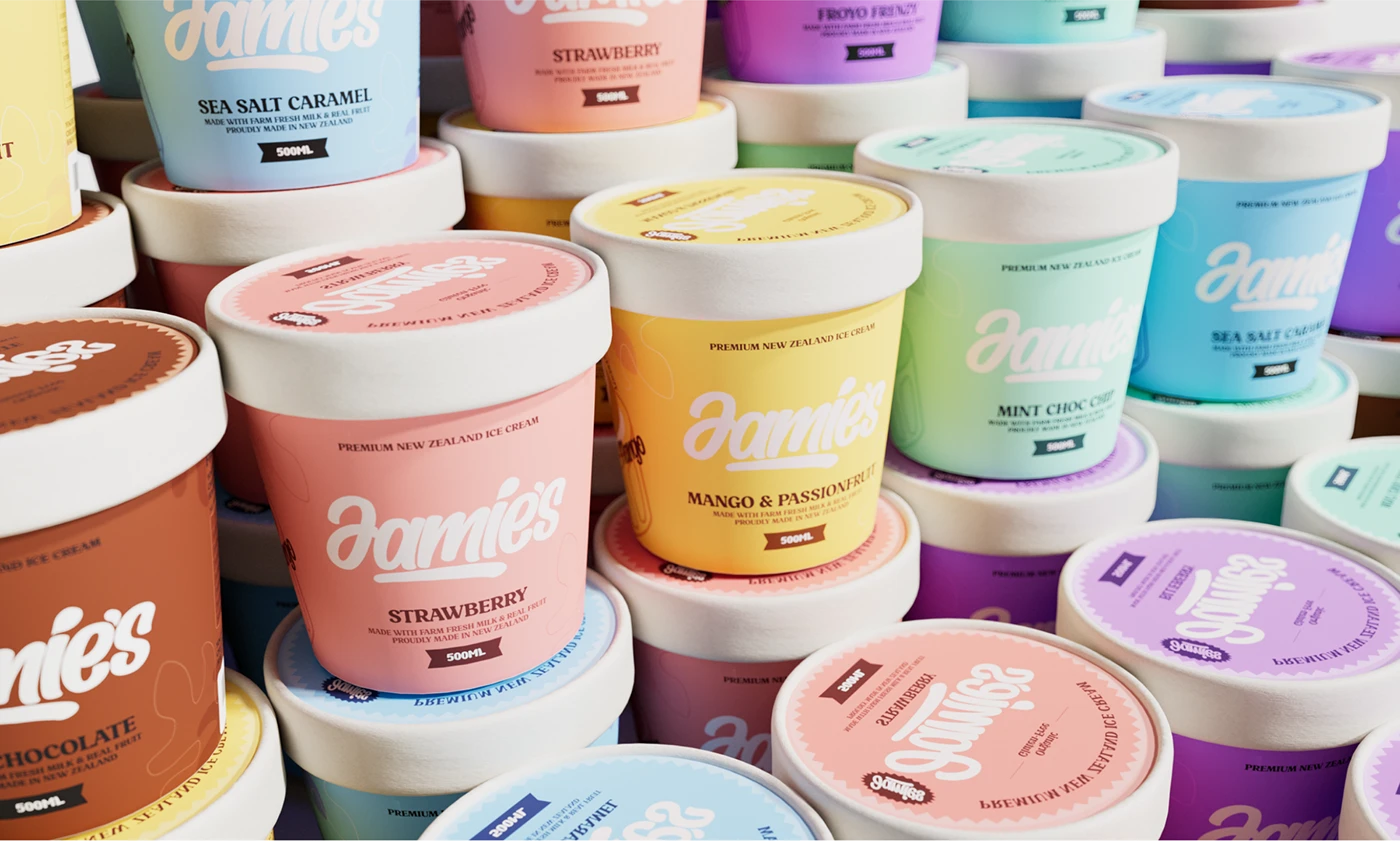
Color is the flavor, the cup is the feeling. Six macaron tones creating a visual break on the white shelf. The color hits, and that afternoon comes back.

Client: Froyo Frenzy LimitedLocation: New ZealandServices: Packaging Design, Brand Identity, Illustration, Type SystemYear: 2025

The Challenge

Jamie's needed a packaging system for a six-SKU premium ice cream line. On the freezer shelf, 80% of competitors use white backgrounds with product shots and tiny logos — visual sameness. Young consumers spend under 3 seconds in front of the freezer. The brand needed to be recognized in 1.5 seconds.

Goal: create a visual break against white packaging, while building an emotional connection.

Design Strategy

Research insight: For 16–25 year olds, color is the primary purchase trigger — faster than reading the flavor name. They're numb to words like "premium" and "real fruit," but color triggers an immediate emotional response.

Core principle: Color is the flavor. The cup is the feeling.

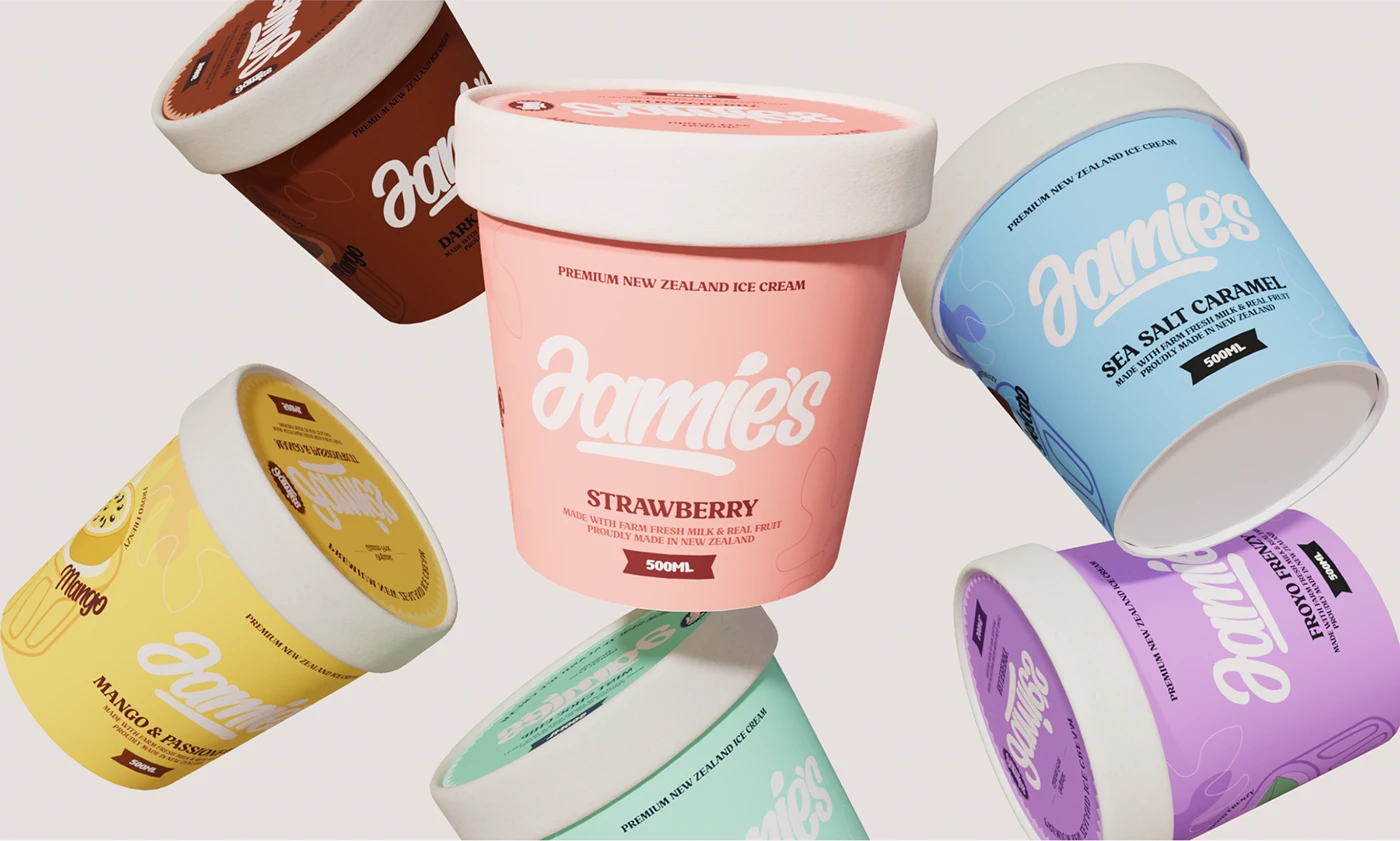
Color moves from supporting element to primary visual. Each SKU is a solid color block — no reading required, the color handles recognition, emotion, and range grouping at once.

What we're going for: The kind of pause you get when you were a kid and ran into the convenience store after school — freezer door opens, cold air hits your face, a color stops you. Not because you're thirsty. Because it reminds you of an afternoon, a person, a moment you didn't say out loud.

Visual System

Color

Six solid macaron tones. Two criteria drive each choice:

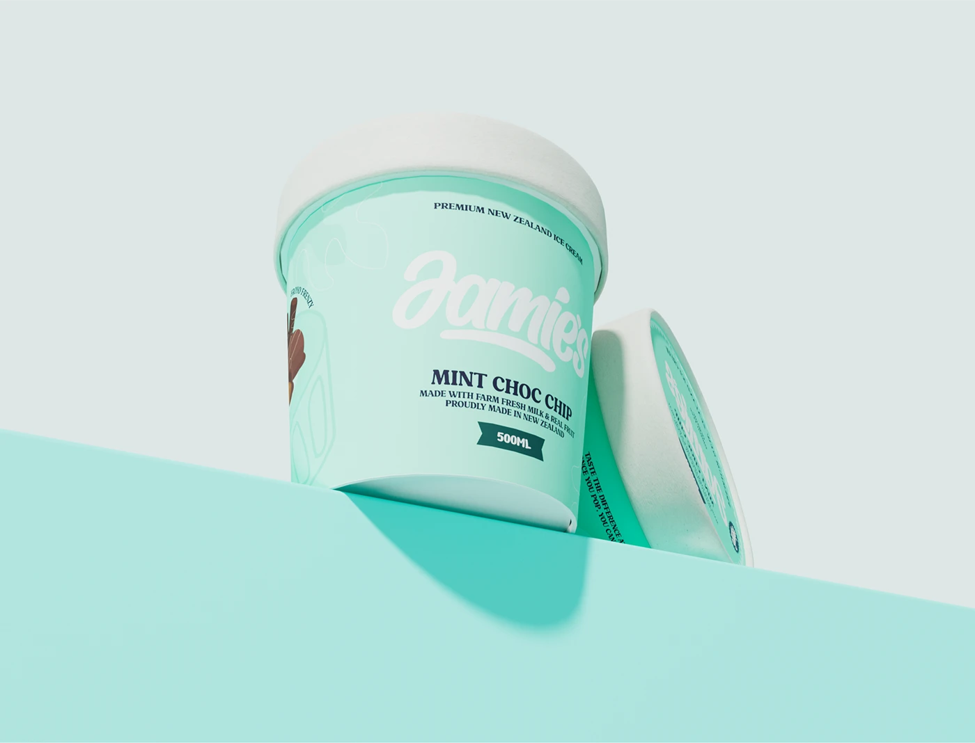
  1. Flavor association — strawberry pink, mango yellow, mint green. The color matches the taste expectation.
  2. Emotional spectrum — from warm (pink) to calm (blue) to deep (brown) to fresh (green). Covers the range of moods a young person moves through in a day.

Saturation sits in the middle range — bright enough to pop, soft enough not to look cheap.

Why macaron colors: This palette carries memory. It's the bright pink, yellow, and blue from the freezer case at the corner store — the one you stared at with pocket change in hand before you finally picked one up. It makes you feel good. It takes you back.

Typography

Three type levels, each with a job:

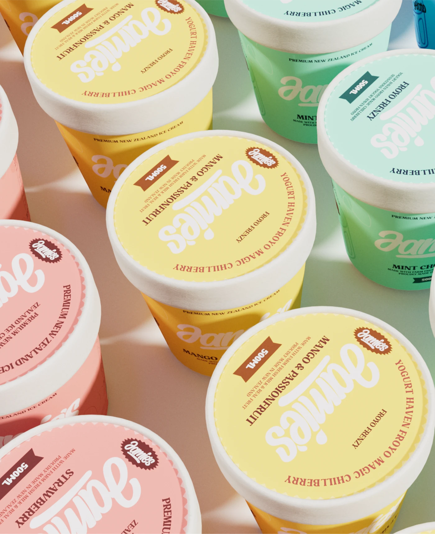
  • Script — Jamie's logo. It creates the maximum contrast against the sans-serif competitors on shelf. Handwritten feels like a note, not a billboard.
  • Bold Serif — Flavor names. Serif reads better at small sizes than sans. Long-distance shelf readability. The classic weight balances the script's casualness.
  • Sans-serif — Ingredients, nutrition, body copy. Functional, stays out of the way.

Illustration

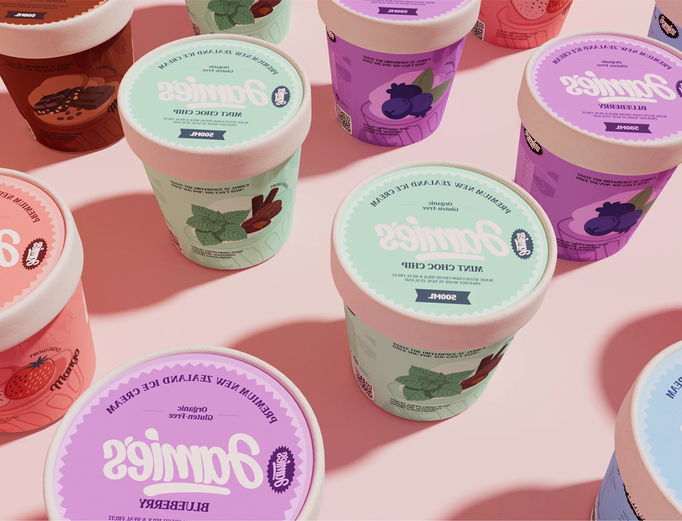
Flat vector. One ingredient illustration per SKU on the left — consistent stroke weight, consistent perspective, consistent color logic. Never more than 40% of the cup width. It's supporting information, not the main event.

Grid

All six SKUs share one grid:

  • Left: ingredient illustration (35%)
  • Center: logo + flavor name (40%)
  • Right: information panel (25%)

Spacing, alignment, and type ratios are identical across the range. Only color and illustration change per SKU. This keeps production scalable and the shelf look unified.

Production

  • Cup: 500ml standard ice cream tub, rolled white rim
  • Material: Food-grade coated paper, matte finish (matte avoids specular reflection that distorts color)
  • Print: Four-color process, spot color control for macaron saturation
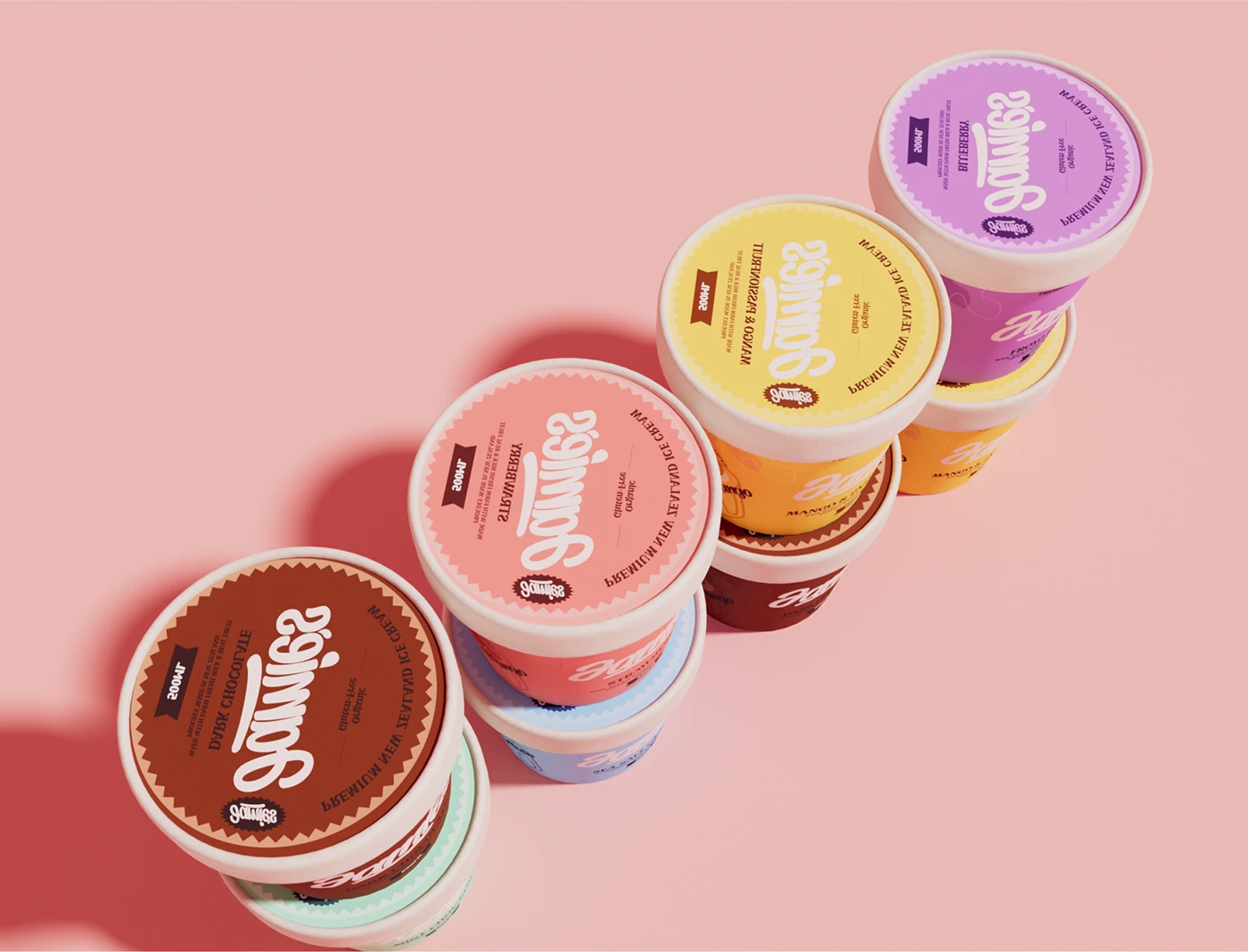
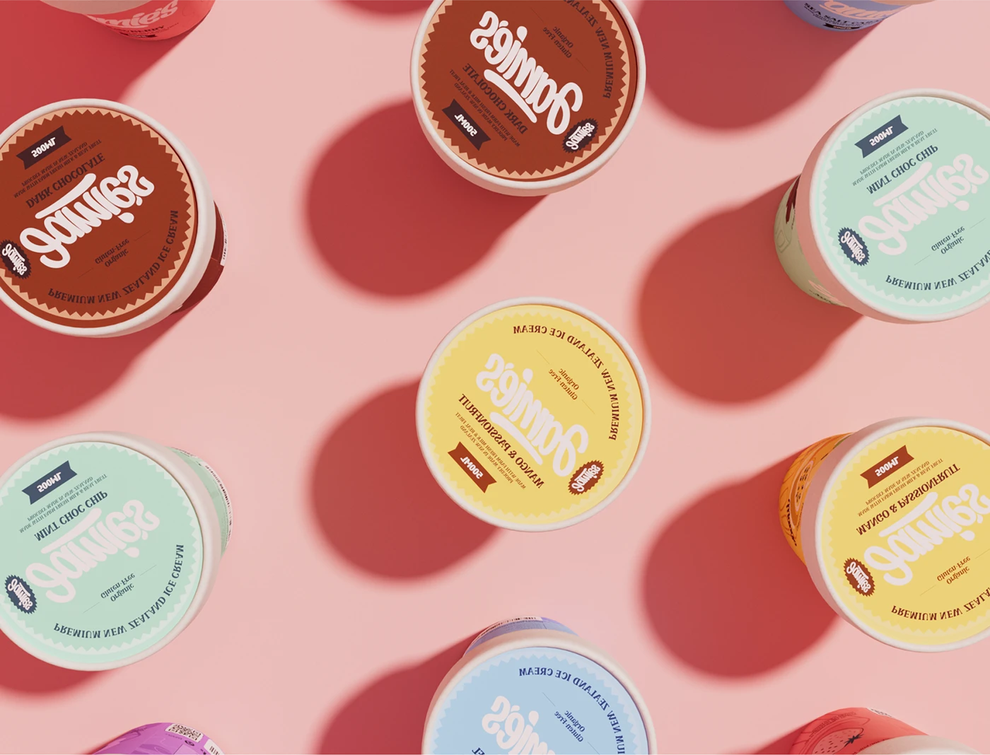
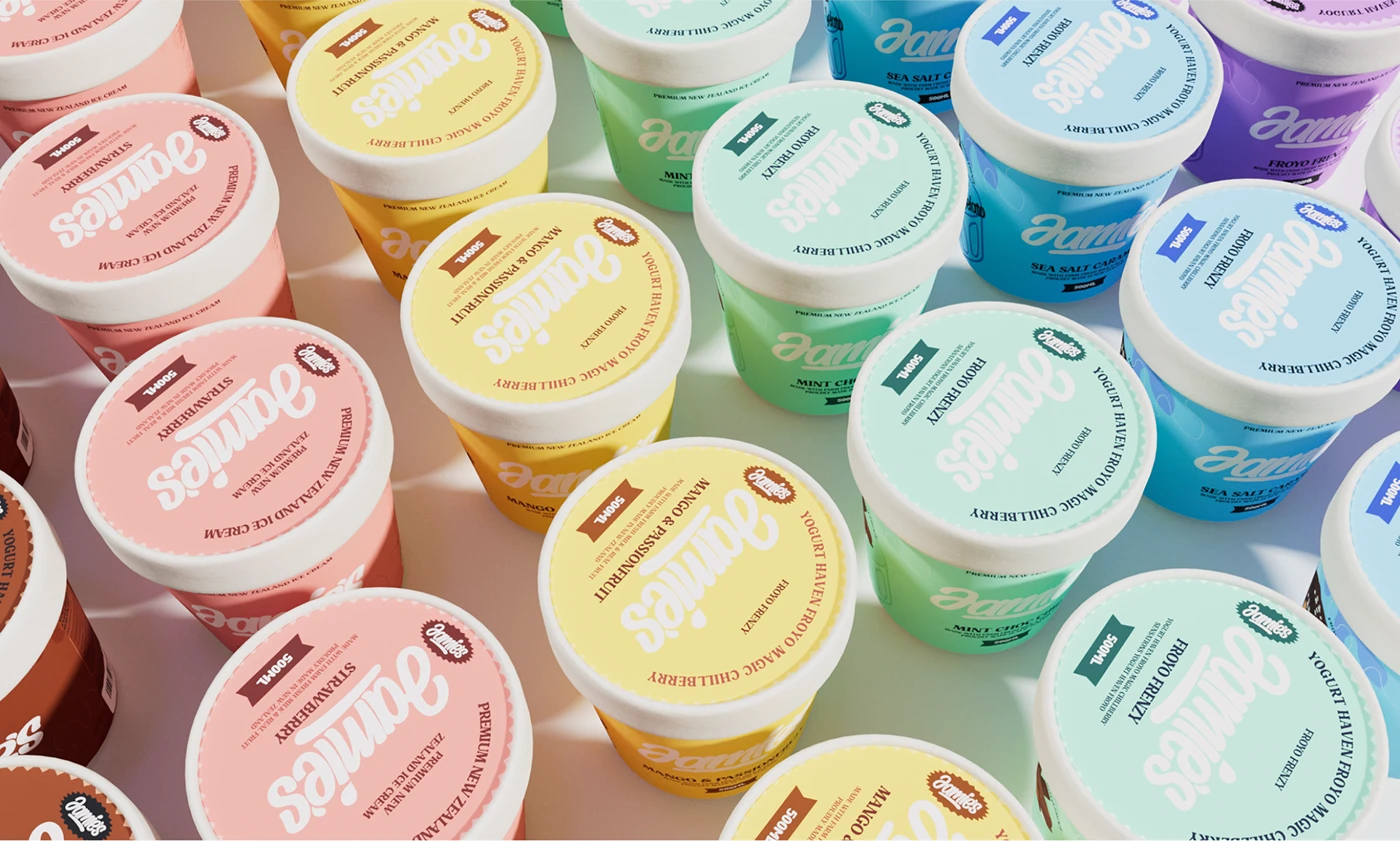
  • Lid: Matching colored paper lid, zigzag seal edge, small starburst brand mark
  • Information: Nutrition facts (per 100g / per serving 125g), ingredients, barcode, QR code, recycling icons

Results

  • Shelf recognition: Six solid color blocks form a visual island against white packaging. Recognized in under 1.5 seconds.
  • SKU clarity: Color coding removes the need to read every label — shoppers pick by color first.
  • Range feel: Six colors together look like a set, not six separate products.
  • Emotional positioning: Macaron palette + handwritten script builds a brand personality that's young but not childish. The color lifts your mood. It takes you back to the walk home from school — campus memories, that first flutter, the corner store.

Jamie's doesn't sell ice cream. It sells another bite of how it felt.
packaging design branding  Graphic Designer Logo Design adobe illustrator ILLUSTRATION  cartoon Digital Art  artwork Drawing

Contact us