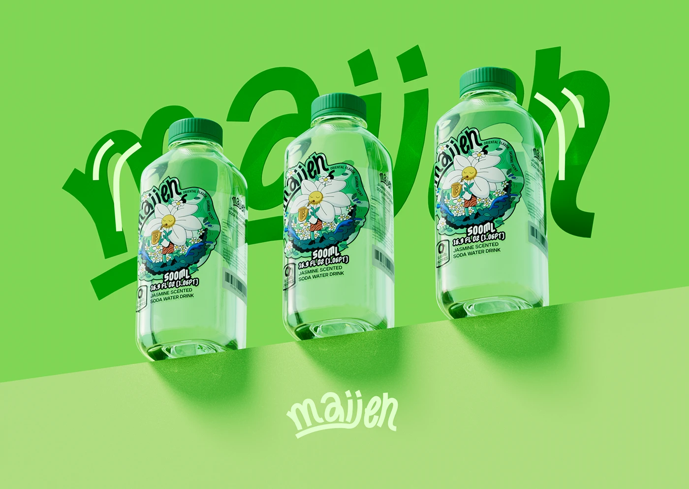
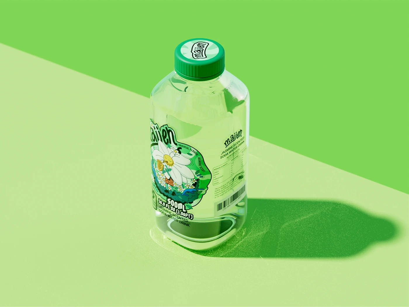
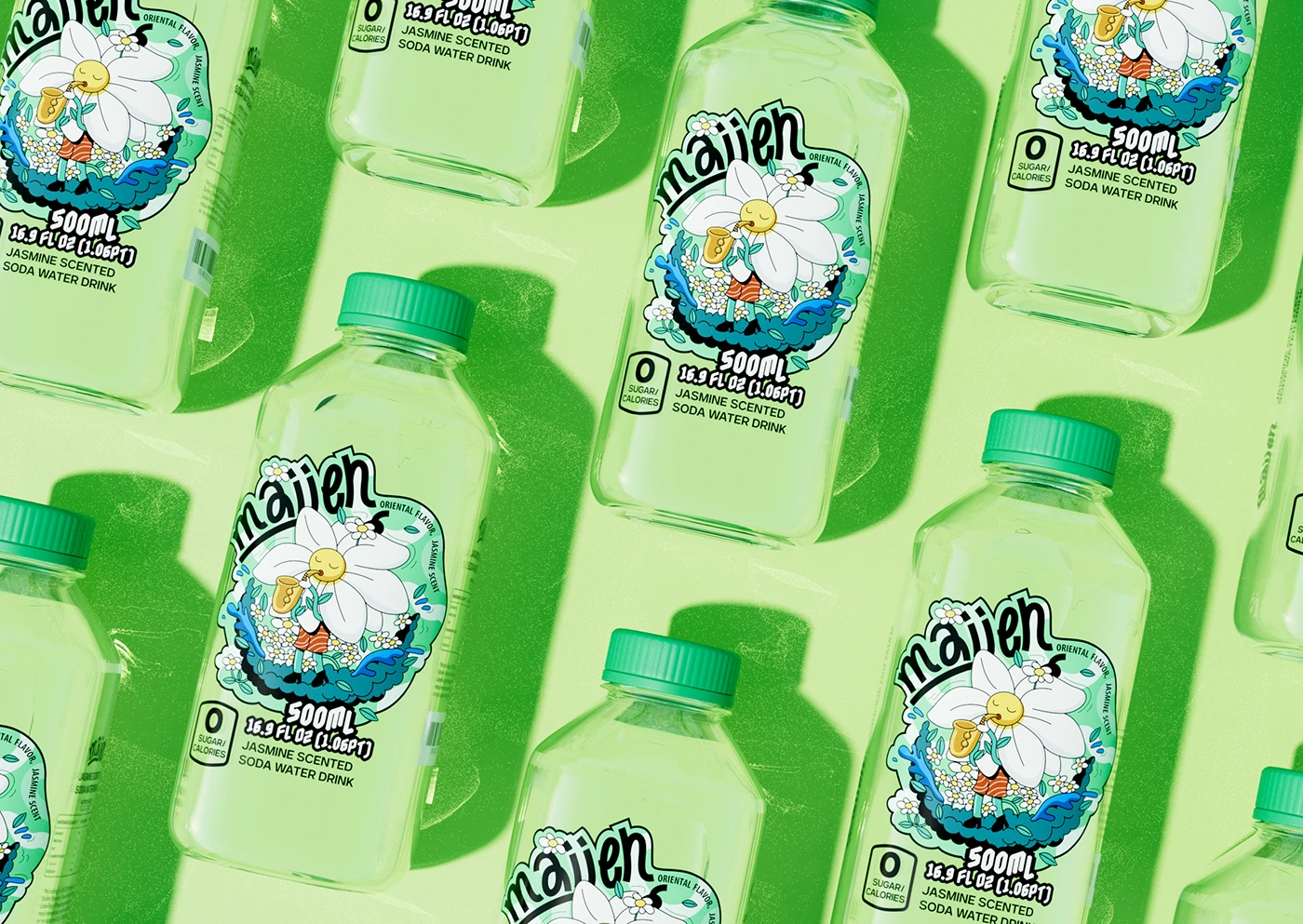
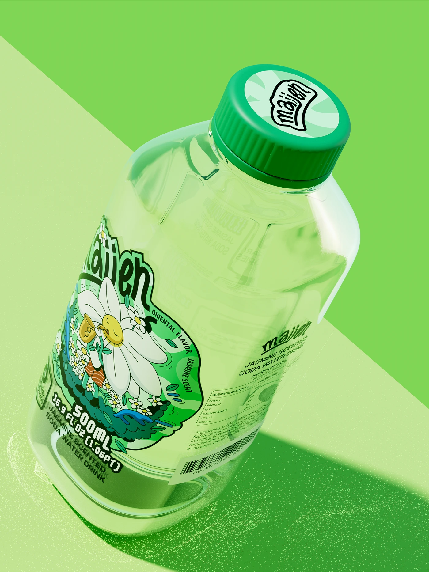
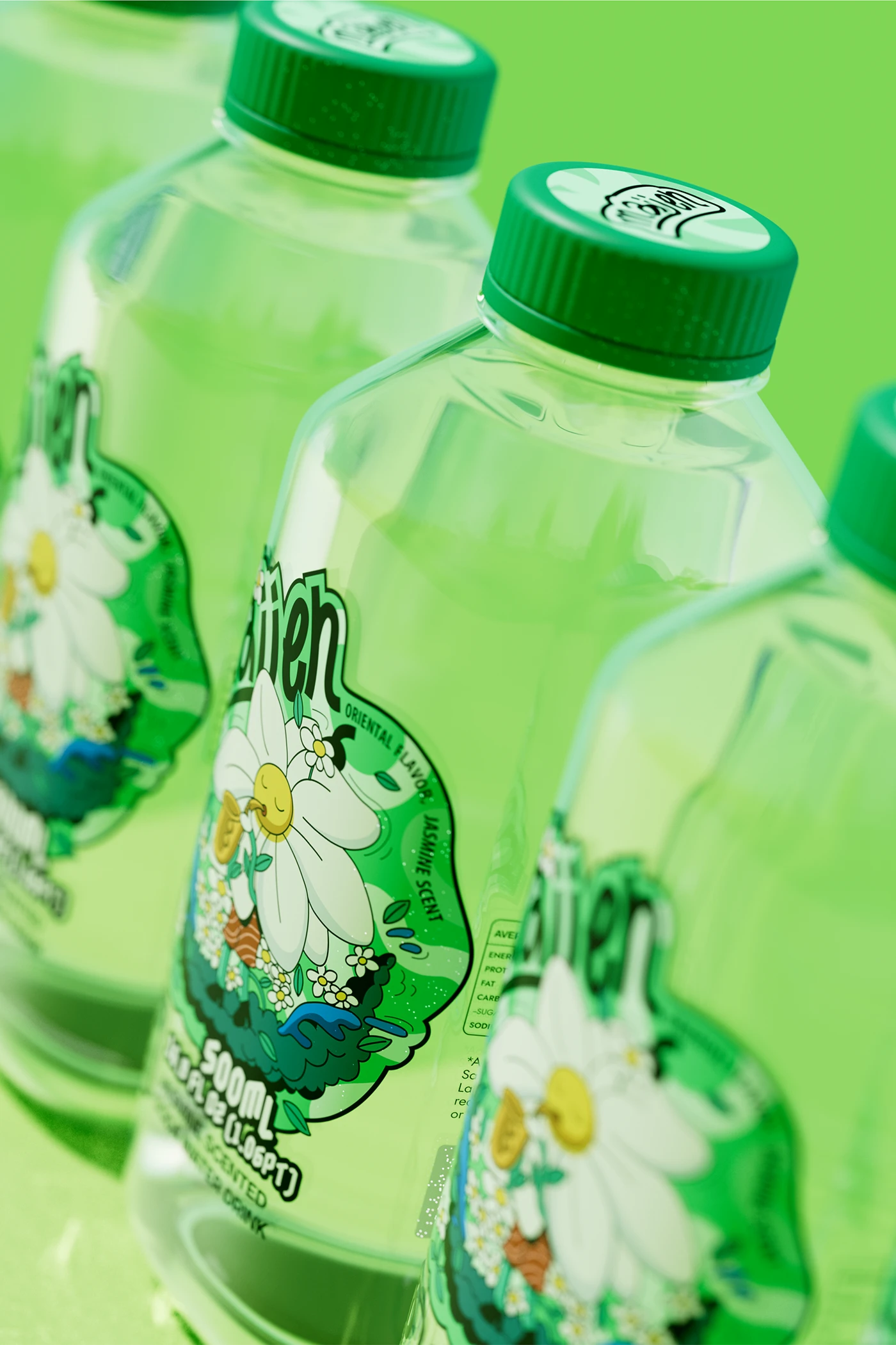
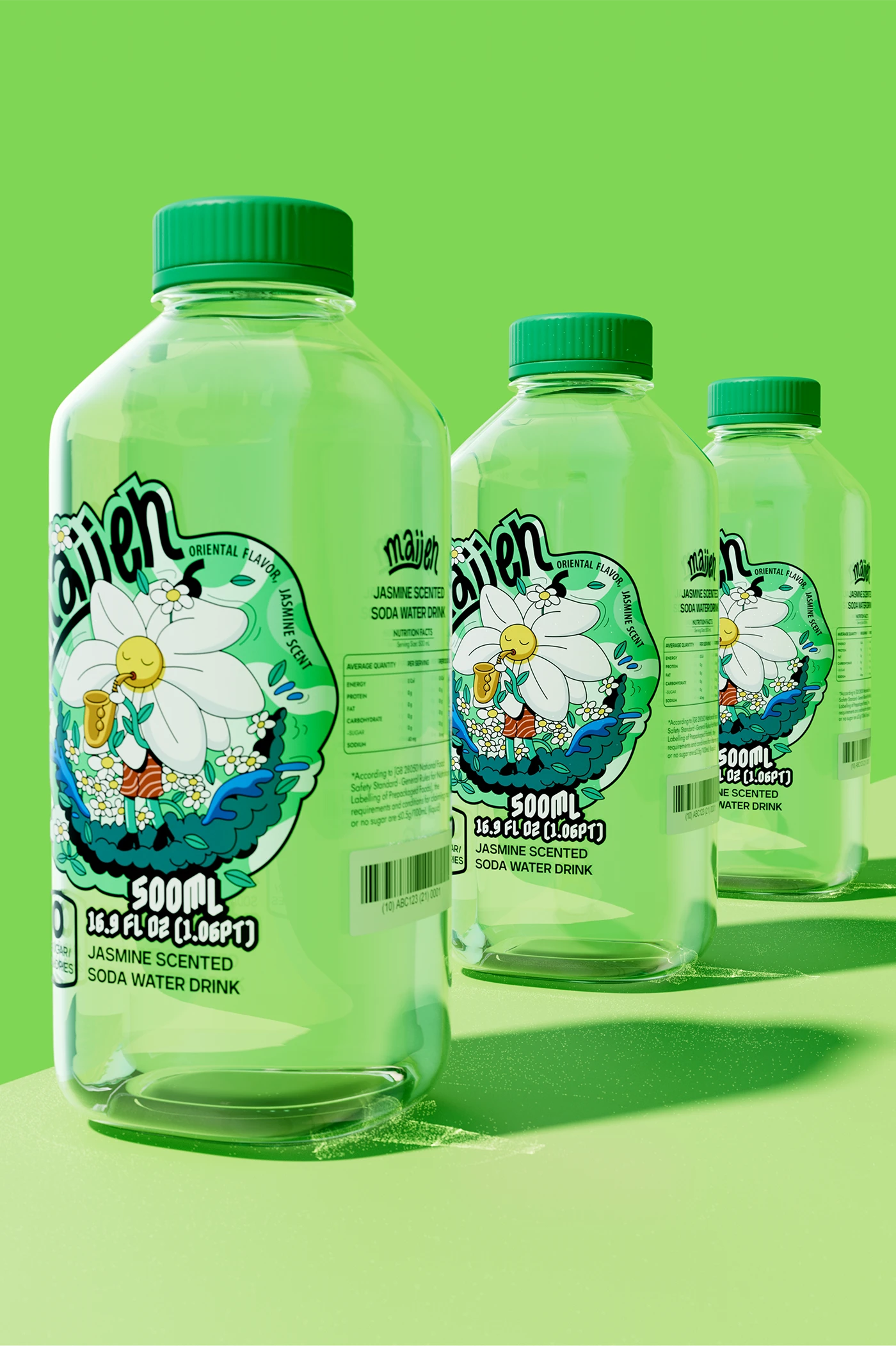
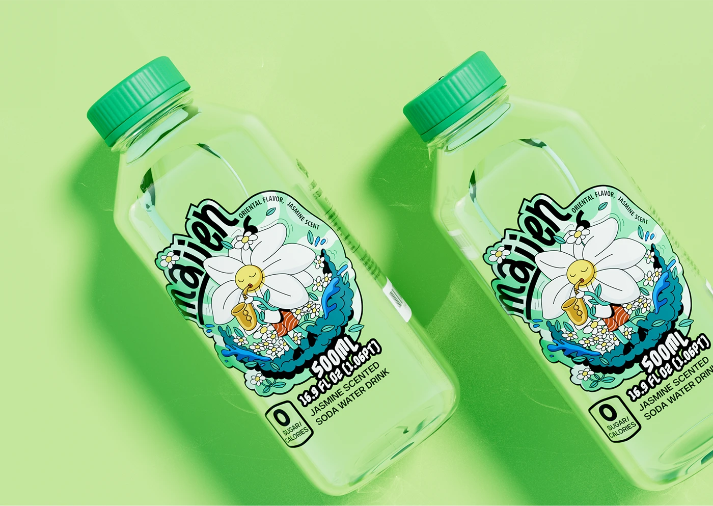
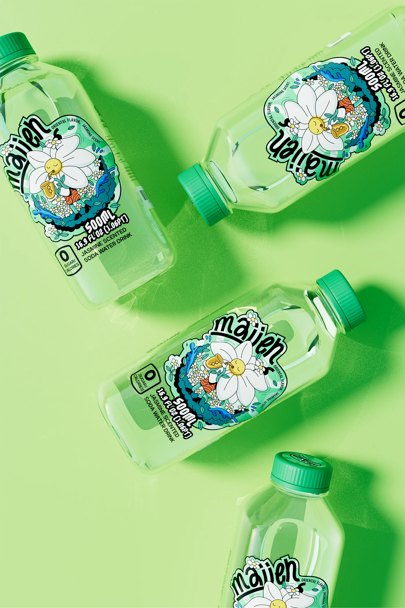
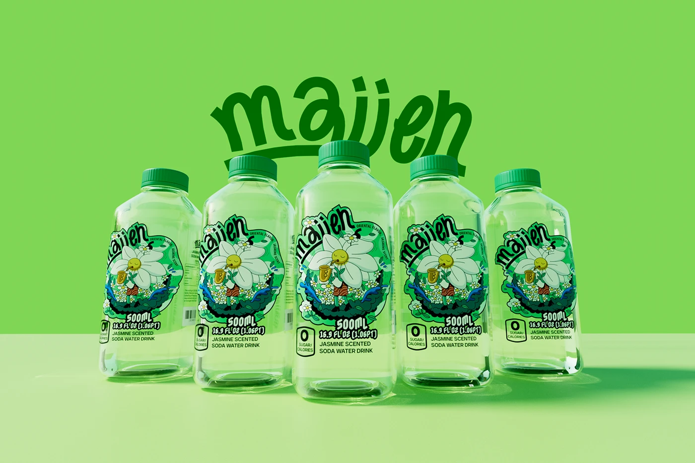
A jasmine flower playing a flute, trapped in a green bottle. Fresh, oriental, a little dreamy.
maiien is an emerging zero‑sugar jasmine‑flavored soda‑water brand targeting Gen‑Z young consumers. The brand wants to deliver a light, refreshing oriental drinking experience. It aims to avoid two common extremes in Asian beverage packaging: over‑minimal modern aesthetics and heavy traditional retro style, and build a unique visual language that resonates with contemporary young shoppers.
Jasmine soda needs to feel like what it tastes like — fresh, light, oriental. Most bottled drinks either go hyper‑modern (clean glass, minimal type) or hyper‑traditional (Chinese calligraphy, lotus leaves). As a new‑comer to beverage shelves, maiien needed a middle path: modern enough for Gen Z, rooted enough to feel oriental.
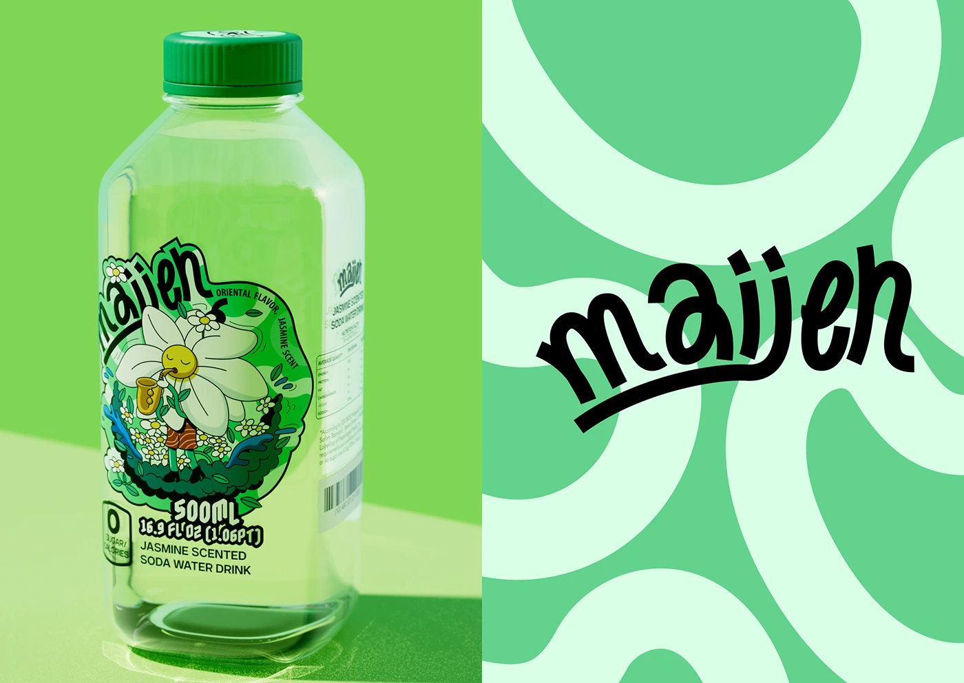
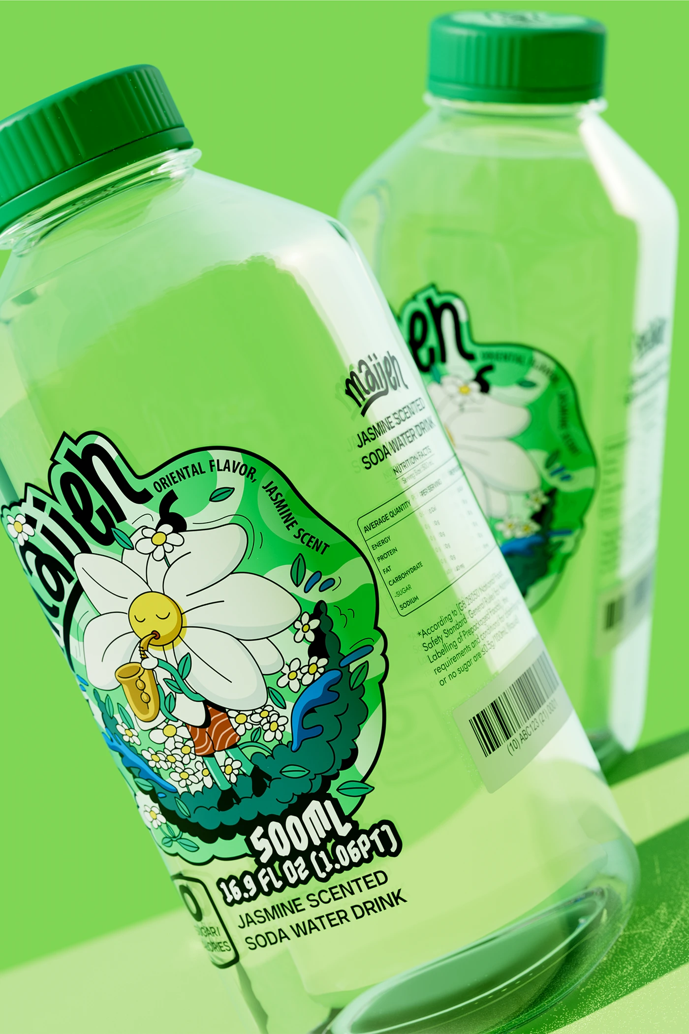
We created a character: a jasmine flower with a face and a body, playing a small flute. It's not a logo. It's not an illustration. It's a little person living inside the bottle — calm, natural, fresh.
Inspired by forest‑concert atmosphere, mint‑green is used as core base tone, matched with aqua‑blue embellishment. Melody is visualized as crystal water‑droplets dancing among leaves. This multi‑sensory narrative links jasmine‑soda flavour to an immersive cool summer‑forest feeling.
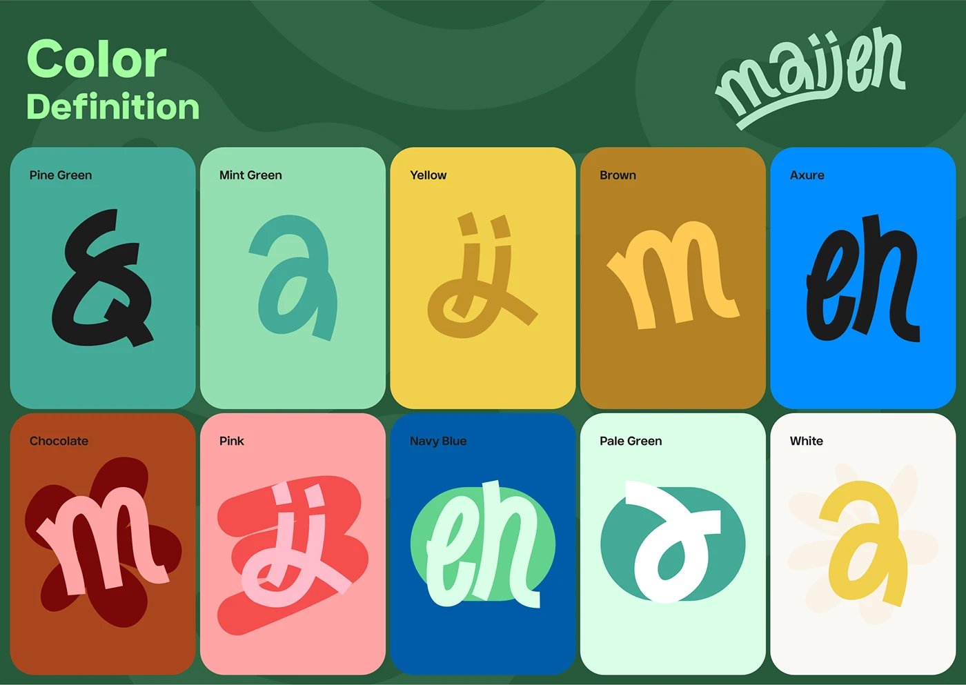
The color is green. Not one green — a range of greens from the bottle to the background. It makes the drink look like it comes from a garden.
The jasmine flower character has:
The style is flat illustration with clean outlines — modern but with oriental detail in the patterns.
Typography"maiien" in a handwritten, slightly rounded script. It feels natural, like handwriting on a tea cup. Below it: "JASMINE SCENTED SODA WATER DRINK" in clean sans‑serif.
The whole system is green — from the bottle glass to the cap to the background in photography. It reads as "fresh" before you read the label.